


26 June 2018 I think the idea for this came from a YouTube video. I…
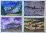
Four Views From A Californian Bus Stop
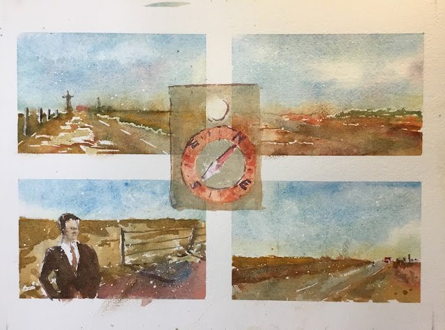
The idea came to me over the weekend when I was watching a famous Hitchcock film on the telly. There’s a famous scene of someone waiting at a bus stop in the middle of nowhere and I was struck by four particular shots in the film showing the two sides of the road and the road disappearing into the distance in both directions. I decided I had to do this quadtitch (is that a word?). I found where the scene was filmed; it’s on a road running East to West in California. So these are views looking North, South, East and West, as indicated by the compass in the middle.
The main colours are cerulean blue, Winsor red, burnt sienna and Indian yellow, so this is in the key of orange cool. I picked Winsor red and Indian yellow for their warmth and threw in the burnt sienna as another warm red for a bit of variety and earthiness. I picked a cool blue after seeing a tip from Hazel Soan in this book talking about how cool blues in the sky can make warm foregrounds look warmer than warm blues in the sky. There’s also a little bit of raw sienna at the bottom of some of the skies and some titanium white highlights in places.
I started this one last night, first measuring up and putting down masking tape and then putting down pencil drawings. I didn’t fancy leaving the paper around for days with masking tape on it, so was determined to finish the painting this morning, even if it meant setting up shop under the eaves of the garage to stay out of the rain.

The first thing I did today was to put down some masking fluid. I wanted some sunny highlights in the roads and fields, some white lines on the road, a crisp white shirt shape on Cary Grant and a little bit of spatter to five a dusty impression.
There’s not much to say about how I put down the paint except that I wasn’t too worried today about asphalted bleeding into each other: the subject suited a loose approach. Once the four subpaintings were complete, I painted on the compass. I managed to find some interesting neutral colours for this. The circular compass dial was originally a bit too saturated, in a vivid red/orange colour but a dab with kitchen paper got me to a more washed out colour that I was happy with. I’ve left the needle slightly more saturated than the dial but I think that was necessary.
I’m reasonably happy with this one. The Cary Grant figure has worked out fine and I like how (in the North and East paintings in particular) the edges are all a bit blurred, giving the impression of a hot, hazy day. But most of all I like the colours. The cerulean blue is the star, supported by all the browns and oranges that complement it from the other side of the colour wheel. The green trees in the North view add a little bit of variety. My only complaint is that the compass is pointing a bit too close to North West whereas I’d rather it was midway between North and North West.
This one’s going up for sale. To see the price, click here.

Leave a Reply