My second painting of the day was a lot more successful. The underpainting was again…

Force Of Life
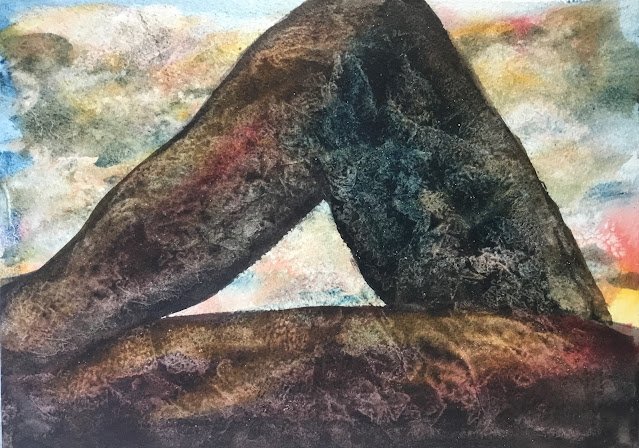
So here’s my second painting of the day. Again, this was all about having fun rather than creating a masterpiece. My idea on this one was to paint a colourful sunset (something I’ve not done for ages) and to put some sort of silhouetted skyline in the foreground. Colours in this one were Mayan blue, Winsor red, Indian yellow and sepia, so I guess this is in the key of orange cool.
I think it was a mistake to use the Mayan blue in a sunset painting. It’s just too bonkers and out of control. Sunsets need to be calm and relaxed. Prussian blue or French ultramarine would have been a better choice. Anyway, on with the show. As with all sunsets, it’s blue at the top, then red, then yellow, then red. That first red is important as it prevents any green appearing in the sky where the yellow touches the blue. I wanted to add some grey clouds in sky and I tried to mix up a neutral colour from my three primaries but without any luck. What I was getting was too watery, so I should probably have squeezed out more paint from the tubes and mixed them together into something drier. But I didn’t have time to do this: the sky was drying too quickly. So I added some quite dry paint for each of the three primaries and ended up with the same sort of colourful cloudy sky as in the last painting and it didn’t really look like a sunset.
While the sky was drying, I looked around for some sort of skyline silhouette that I could put on top of it: this was all done on the fly without any planning. I ended up choosing a pair of legs from a shot in a Space 1999 episode called Force Of Life. It’s a silhouette that I’ve been thinking about using for a while.
So I added in the silhouette using some quite thick sepia. I deliberately went for sepia as it’s an opaque colour and I didn’t want the colours in the sky shining through the legs. I was careful with the brushstrokes to show the fold at the knee and to distinguish the legs from each other. While the sepia was still wet, I dropped in all three primaries. And I added some salt and did some kitchen paper dabbing to create textures.
This feels like another winner to me, so is going up for sale. To see the price, click here. The legs look like legs, but having them against the sky raises doubts in the viewer about whether they might just be rocks. And the textures in them are strangely fascinating. I think when I frame this and lose a bit around all the edges, I need to lose more from the bottom than the top, make that bottom leg less boring.


Leave a Reply