


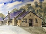
Next I wandered over to the village hall and found a comfortable place to sit…
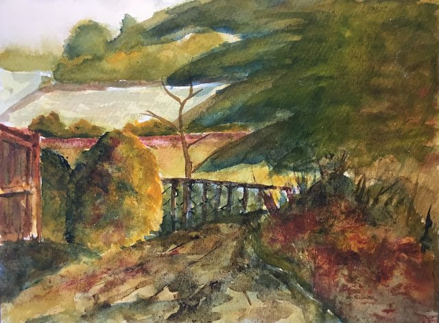
Footpath From The Village Hall To The Park, Hartlip
Back onto my series of Hartlip paintings with a bit of a clunker.
Starting colours in this one were Prussian blue, Indian yellow, rose dore and burnt umber. Rose dore didn’t play much of a role, with burnt umber (making a string return after being on the bench for a while) tending to take the role of the red, but either way, this was painted in the key of orange cool. The acrylic inks joined in later, alone with cadmium red and cadmium yellow.
There were a couple of composition errors that didn’t help. The tree in the middle adds nothing and should have been left out. The fences and wall in the distance could also have been left out. And I needed a better plan for how to deal with the fence in the middle. And then there’s the tree in the top right. It did need to cover all that area but should have been painted as several overlapping trees.
When I reached the first possible stopping point, the painting was looking dull and lifeless. I had to do something else. I tried adding a dog walking figure but it looked really bad, so I blotted it out. I did a couple of thin glazes in an attempt to unify things. I thought about adding Zoltan Szabo-style “curtain glazes” down the left and right sides but eventually decided against it. In the end, I had to resort to the acrylic inks and granulation medium to liven up the path the conifers and bank on the left and bank on the right. I spattered on cadmium yellow and red in the banks, then added some cadmium yellow to the middle of the tree in the top right in an attempt to bring its middle forwards. Finally I added some granulation medium to some of the ink-free areas. And some salt and some water drops in places in an attempt to create some more texture (neither of which worked).
And here’s what I ended up with. It’s a bit of a muddy mess. Definitely not something to go up for sale. Although I could, at some point crop off these two pieces if I can find a couple more similar sized cropings in other rejected paintings and a picture frame with four suitably sized windows. The reds in that bottom right corner really work well but I can’t take the credit for that – it’s what the inks decided to do.


Leave a Reply