I've been taking another look through Ann Blockley's Watercolour Workshop over the last couple of…

Flatter To Deceive
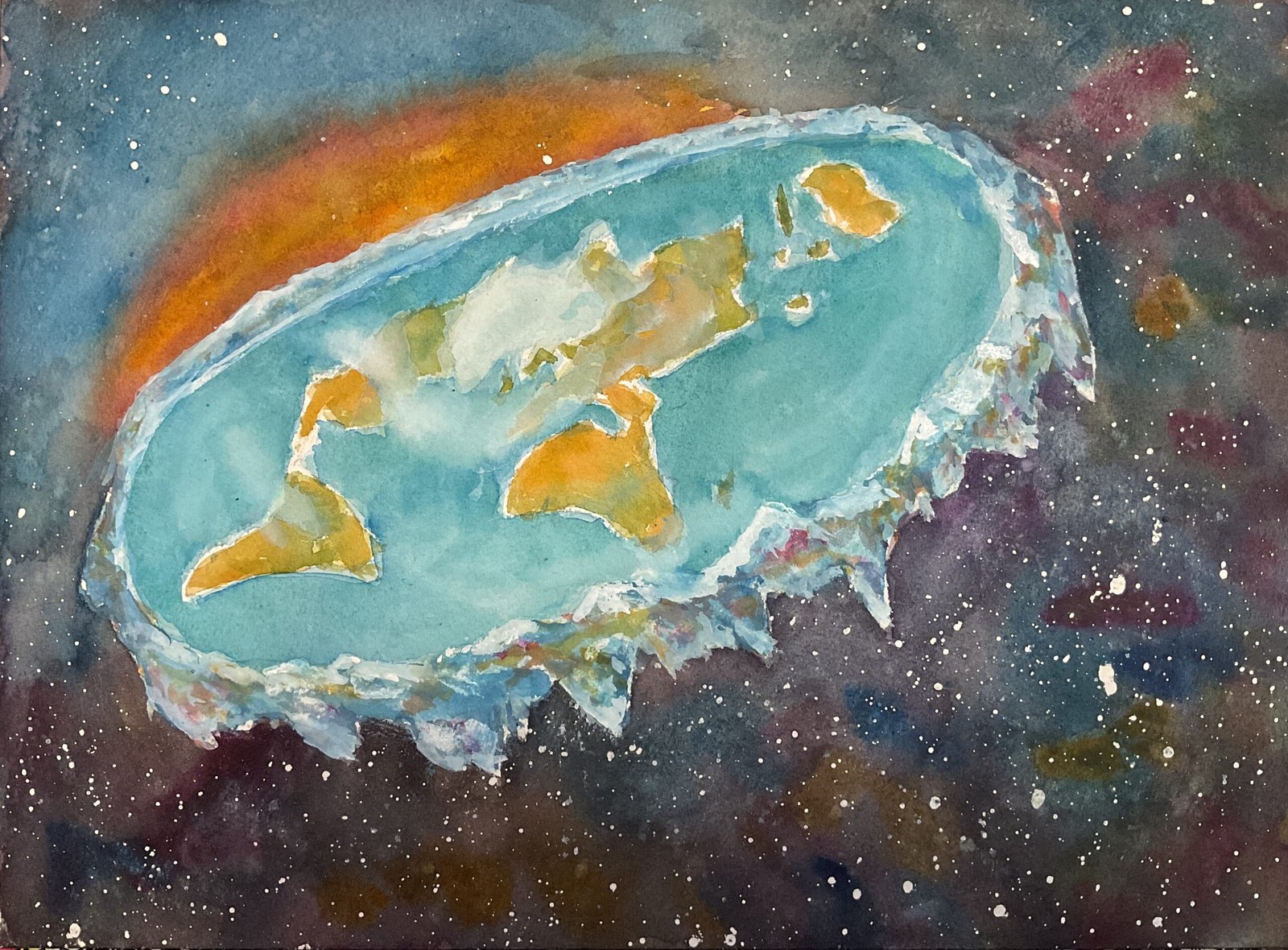
I’ve finally gotten around to completing my Planets collection with a portrait of Earth. I don’t know why this has taken so long because I’ve had the idea of a flat Earth painting in my head for a while.
The min colours today are Winsor blue (green shade), quinacridone magenta and Indian yellow and there were cameo roles for virudian, titanium white and white gouache. The Winsor blue was always going to be first choice and I close the red and yellow that combined with it to make the best background space colour. With viridian not being that different from a cool blue, this one is in the key of triadic left.
There are three elements to this one. Let’s take the background first. I started by spattering in a starry background and removing any spatters on the Earth and most of the spatters in the top left. This was the only masking fluid I used today: I didn’t mask out the icy ring. Then, once the spatters were dry, I wetted the while background, then started with a sunset sky in the top left, with a band of red along the horizon, followed by the yellow, more red and the blue. For the rest of the sky, I dropped in all three primaries in places, allowing things to mix and trying to keep things generally dark. The dark background ended up looking a bit too colourful, so I laid a couple of thin glazes over the top, with a dark colour mixed from all three primaries. With things looking more under control, I also dropped in dry paint from the three individual colours in places. To avoid hard edges, I also needed to glaze over the sunset too, and I think I unfortunately lost a little of the light in the painting when I did this.
The land masses and sea were pretty straightforward. The sea is made do a couple of layers each of the blue and of viridian, which together give a good sea colour. I put on a couple of layers of greens and oranges quite loosely, mixed for: my three primaries and these worked out well. I added the Arctic ice cap in white gouache and some clouds with titanium white. There are some twirly patterns in the oceans that started as titanium white before being replaced with kitchen paper marks when the final layer of viridian was still wet.
For the icy ring I started with random mounting shadow marks with ll three primaries and their associated secondaries. I fiddled with the ring a lot, adding more colour and using both whites, before identifying a three step plan to get to a point I’d be happy with. What I did was to (i) soften things using the titanium white trick, painting over a watery glaze of titanium white then dabbing it off, (ii) unifying the ring with a watery glaze of the blue all over, and (iii) once that was dry, adding some snow in places with the white gouache. And that was me done.
What I’ve ended up with is something interesting even if there are things that I think I could have done better. I think it’s the sunset that bugs me the most: I wanted to see a band of bright yellow in there and for there to be a lighter, skyer blue between the sunset and the night sky. Instead, the shape of that orange area makes this one look like the underside of a jellyfish when you catch it out of the corner of your eye. Maybe I’ll pretend that was deliberate. It’s not going in the shop window though.


Leave a Reply