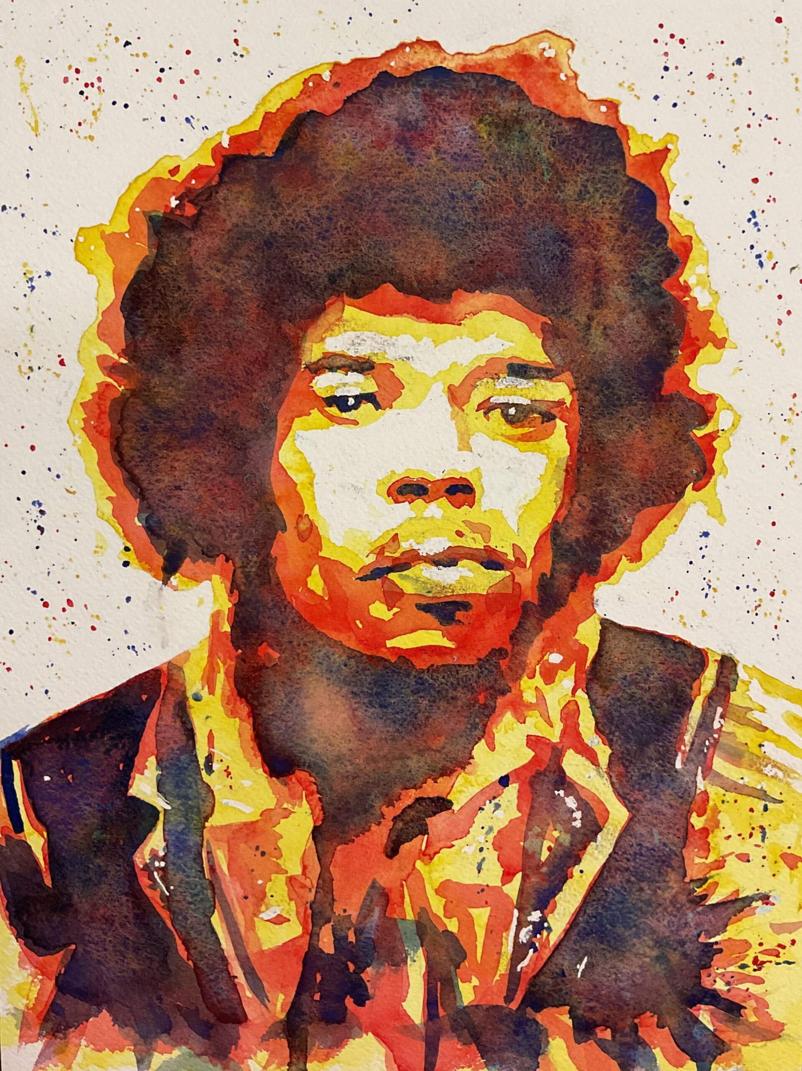
Today it’s a portrait of Jimi Hendrix. You can tell that I’ve used the Artist Assist App again just by looking at this one. I was planning to do a triple portrait but the plan that the app came up with was so complicated that I decided I’d be better off doing just the single portrait. I decided on the transparent yellow / Winsor red / French ultramarine triple glaze combination not just because Jimi was wearing an orange shirt in my source photo but also to reflect the fire in his guitar playing. Also reflecting the fire are the spatters of primary colour, the big dry splat in the bottom right and the name of the painting, a Hendrix track because I’ve already created a painting called Jimi Hendrix.
The other thing, besides the spatters, I did differently today to normal was to attempt to make the colour layers uneven. After each layer went down, and while it was still wet, I dripped on some granulation medium and charged in stronger versions of the paint that was wet. It wasn’t until the blue ultramarine layer went on that the results appeared: French ultramarine is a granulating pigment anyway but the results here are amazing.
Not everything went perfectly though. I made at least three mistakes:
– On Jimi’s right lapel, there’s a bit where I didn’t put down red but should have done, especially as I needed to put blue on top of that. I got a bit lazy here and put the blue down anyway, then the red on top of that. You can see it looks a little bit different.
– The right side of Jimi’s mouth (our left) wasn’t out far enough. So I put in a bit more blue to extend it out to under Jimi’s iris.
– I started putting on blue paint before the red was completely dry. Or when it was dry everywhere except in Jimi¡s neck. So two blue shapes, one at the top of his neck and one at the bottom, diffused into the middle of his neck to make one big shape. I tried to dab off the offending blue, but most of Jimi’s neck is now a muddy colour rather than having a big orangey shape in the middle.
To be honest, though, the results aren’t that bad. You’d have to know that something was wrong to notice that it was wrong.
Overall I’m happy with this one. These triple glazed paintings are designed to work at a distance and, from a distance, the likeness is definitely there. Add in all the fire and energy and, yes, this is one of my favourites. Jimi’s up for sale.
To see the price, click here.


Leave a Reply