


Before I start talking art, a bit of news. I retired on Tuesday. Eighteen months…
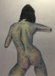
Felicia, Blinded
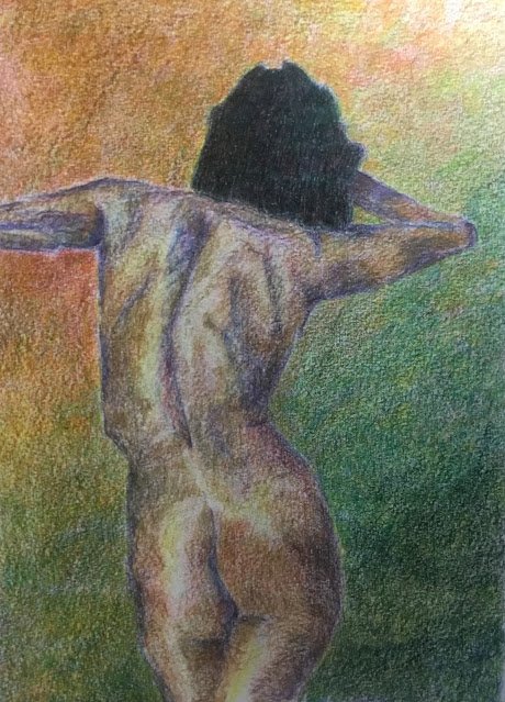
So I finished reading Masterful Color and was ready to put some of its ideas into practice. Today’s model is Felicia, making her fourth appearance. In fact this is a different view of a pose I’ve painted before.
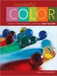
Following Arlene Steinberg’s recommendations, I started with an underpainting of complements. I wanted a green background to contrast against fleshy tones, so put a red background in the underpainting. And because blue-purple was the closest I could get to a complementary colour to flesh tones, I put in the dark values on the body in blue-violet. I also put on some indigo in the darkest areas and some cool blues in parts of the body that I was intending to make redder.
In the underpainting, most of the colour was applied with sharp pencils moving in small circles (another book recommendation) although I also added some colour with the side of the lead where I needed less intensity. I added several different layers to the hair too – I wasn’t going for the pure black look today (book recommendation). Here’s the underpainting I ended up with:

The background ended up with just three layers of pencil colour. The first layer was red, three similar but different reds in horizontal bands, blended together. The second layer was green, six different greens in upward sloping bands from lighter greens at the top to darker at the bottom, all blended together. And the final layer was yellow, a warm yellow in the left and cool on the bright, blended together where they met above the head.
After the initial underpainting, I added layers of red and green to the hair. It was liking close to black after this, so I stopped on the hair at that point.
On the body, I applied several layers, generally alternating between realistic flesh colours and the blues and purples with which I’d marked out the darks. Occasionally I would throw in some impressionistic reds, oranges, greens and blues where I could see them in the source photo. Most layers were scribbled in small circles but occasionally (and every time for the impressionistic colours) I’d use the side of the lead if I didn’t want full on colour. I found myself getting a bit frustrated at how the flesh colours (like ivory, cinnamon and coral) weren’t turning the purple in the underpainting into a neutral colour (so the purple can’t have been the best complement) but I eventually found that raw sienna neutralised the purple. So I put in a layer of raw sienna. I was careful to leave light areas untouched by the raw sienna to prevent it overpowering the painting. And flesh colours would have gone on top of the raw sienna at some point.
When I was finished, I burnished the flesh and hair with a colourless burnishing pencil (as per the book), not bothering to sharpen it when it went blunt (book again) and wiping all the burnished areas with a cotton wool makeup remover pad (yeah, book). I didn’t burnish the background because it looked great as it was and because the figure stood out against it. Oh, and there were examples in the book where Arlene burnished the subjects but not the background.
It might be worth me saying at this point that the book tells me to not stop adding layers until there’s no white of the paper showing and that I ignored this instruction! I quite like how there are white flecks showing off the tooth of the paper.
And that was me done. This took a lot longer than my normal paintings. It probably took four or five hours, so I’d have to speed up if I ever made it on to Drawers Off and wanted to do a painting like this. But never mind that, the Arlene Steinberg book has both given the quality of my coloured pencil paintings a sudden step up and opened up a new direction in which I can keep improving. This one’s definitely going up for sale and I’m excited about continuing to paint in this style and to get better. To see the price, click here.
Leave a Reply