Before I start talking art, a bit of news. I retired on Tuesday. Eighteen months…

Felicia
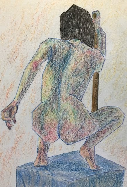
It’s still raining here and more’s due tomorrow. I know I’m overdue a watercolour but I can’t be going outside in this weather, so I’m stuck indoors with either inktense pencils, coloured pencils or markers. Today it’s the coloured pencils again and the model is Felicia, making her debut. I picked out this Thor-like pose, thinking it would be more challenging that the static poses that I normally pick.
I need to keep challenging myself with these paintings, I really do. The thing I did differently today was to set out with the intention of allowing all the value shapes on the body to have curved edges so that I could sculpt a bit of three dimensionality. Yesterday I was too intent on keeping straight edges everywhere, even in all the shadowy value shapes.
One bad habit I’ve settled into in these figure drawings is using grids to get my starting drawing down. Quite fine grids too: seven by five for the coloured pencil drawings. I do need to get out if this habit. Maybe I’ll start tomorrow.
So, yes, I got down the original drawing and then coloured it in, using darker colours in the darkest places and otherwise putting colours where I could see them or just where they felt right. I think I started with blues, putting down the darkest areas with warmer blues on the right and cooler on the left. I then spotted some reds in the cheeks, so added reds there and in some other places like the hands and feet. Screwing up my eyes, I thought the painting needed some green as, so added them. Then some yellows. I just carried on like this, looking for what colours were missing them and adding them in.
Obviously, the hair, the blanket and the stick had their own colours. The stick was pretty straightforward with loads of different browns, darkest on the right and lightest on the left. But for the hair and blanket, I was a bit more free and easy, just putting on whichever colours I fancied.
For the final burnishing, I used ivory all over the body and some blues and greys on the blanket. I outlined the figure in blue, with a warm ultramarine on the right facing edges and a cool pthalo on the left facing. With blue looking pretty dominant, I shaded the background in orange, its complement. When I stood back, I wasn’t convinced my shadows were dark enough, so I went over them with the edge of a Prussian blue pencil and the colour stayed on despite the earlier burnishing.
The final result looks OK and is worthy of a place in the shop window. To see the price, click here. But the pencil strokes on the blanket look lazy and I need to put down outlines that match the adjacent colour. It generally looks like I’ve been following a recipe. I do need to mix things up a bit.


Leave a Reply