So, after that failed experiment, I thought I'd experiment some more. Let's face it, I…

Failed Experiment Part 1
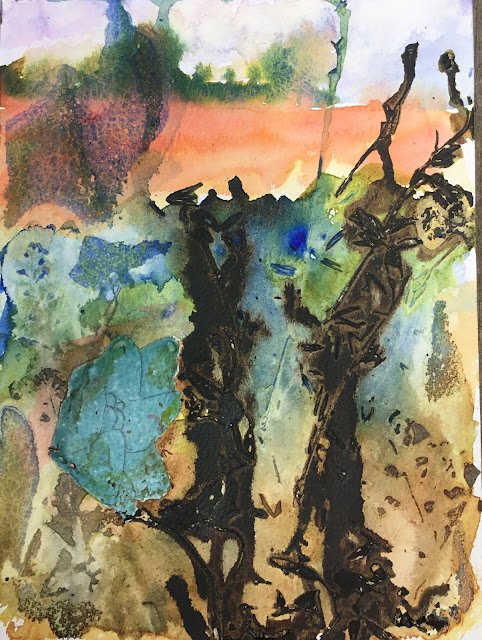
Today’s painting was an experiment that went really badly.
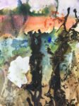
I sketched out a composition first. A bit of sky, a field in the background and a poppy in the foreground in front of lots of brambles. The poppy has been masked out and the (blue coloured) masking fluid is still there.
I used a lot of colours in this one. Nine watercolours plus an ink. The sky was in French ultramarine with a bit of quinacridone magenta and raw sienna. The background trees were in French ultramarine and transparent yellow. And the background field was (the still under trial for a place in the palette) rose dore and Indian yellow. I let the trees, sky and field bleed a bit into each other but then let them dry before moving on to the brambles.
But then for the foreground brambles, there’s French ultramarine, transparent yellow, burnt umber, burnt sienna, sepia and a bit of rose dore near the poppy. I tried to keep some unmixed blue near the top to look like bluebells. And then I went with some Ann Blockley style experimentation. While the paint was still wet, I dropped on some garden cuttings and leaves, then covered it all in cellophane and taped it up tightly. Finally, I made holes near the bottom of the biggest stalks and poured in some sepia ink. I then left it to dry overnight.
And here’s the result. Not great, is it? Looking back at my Ann Blockley book, I think I should have applied thicker paint to the brambles and weighed it all down with something heavy as it dried. It’s also clear that I poured in too much of the sepia ink. Oh well, lessons learned.
There are some successes here though. Rose dore gave a good account of itself when used to mix an orange and may well replace light red in my palette when that colour runs dry. Better to have a genuine transparent warm (orangey) red that looks a like a primary than a semi-opaque warm earthy red that doesn’t add much to a palette that already includes burnt sienna. The idea of the orange field (which is nothing like the field in the photo that inspired this one) was to contrast against all the greens in the rest of the painting). I need to try out orange background fields more often. Thye’re effective. The other success is something that doesn’t show up in the photo, but the foliage has left some foliage shaped contours in the paper surface which will still be there even if the images of the foliage are painted over. Interesting.
This painting hasn’t been completely abandoned yet. I’m having one more go at those brambles with a different experimental technique.


Leave a Reply