


Looks like today's going to be a swatching day. I started with the crystalline watercolours.…

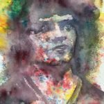
Eric Morecambe
It’s a portrait of Eric Morecambe today in crystalline watercolours. I put down a pencil drawing last night, dividing Eric up into highlights, mid tones and darks with the intention; of finishing him off today. I had a long think overnight about whether to finish the portrait with crystalline watercolours or to switch to normal watercolours and do a posterised portrait in the trippy colour scheme. I ended up going with the crystalline watercolours, partly because I was using hot pressed watercolour paper, which would better suit the crystals, but also because my portrait felt a bit off and I thought the crystals, being inherently looser, would be more forgiving of my inaccuracies.
So, on to the painting. I masked out all the white areas and left things to dry. Then I sprinkled crystals over all the dark areas painted over them with a wet brush to fill out all the dark shapes. In the background, I made sure my brushstrokes were in random directions and kept hopping around the painting rather than working methodically and filling shapes out the way that a decorator would paint a wall. Before I moved on to the final stage, I added extra crystals on Eric’s shoulders me pointed them in, thinking that the portrait needed something more defined to sit on. The final painting step, once everything was dry, was to sprinkle crystals over the mid tones, spray them with water, leave for a few seconds, then bring a halt to the soaking of pigment into the paper by laying on some kitchen paper and pressing down hard to absorb as much as possible.
Everything looked a mess after this, as usual, but then came the best bit: the removal of the masking fluid. It will never cease to maze me how this brings the painting to life and how much better all the coloured shapes look with the hard edges that the masking fluid has given them. At this stage, my background darks and my textured mid tones looked as good as they’ve ever done, which suggests I’m starting to get the knack of using this medium. But, unfortunately, the likeness wasn’t there. I tried to rescue things by adding new dark shapes in places and even an extra layer of brushed over crystals around Eric’s hair to separate it from the background but that didn’t work and, to be honest, defeated the whole purpose of this three value painting.
This one has to go down as a flop. It’s supposed to be a portrait of Eric Morecambe and it doesn’t make me smile. That’s not a great sign, is it?
Leave a Reply