


With the whole day available for painting today, I've finally completed a watercolour in the…
Eilean Donan Castle, Dornie
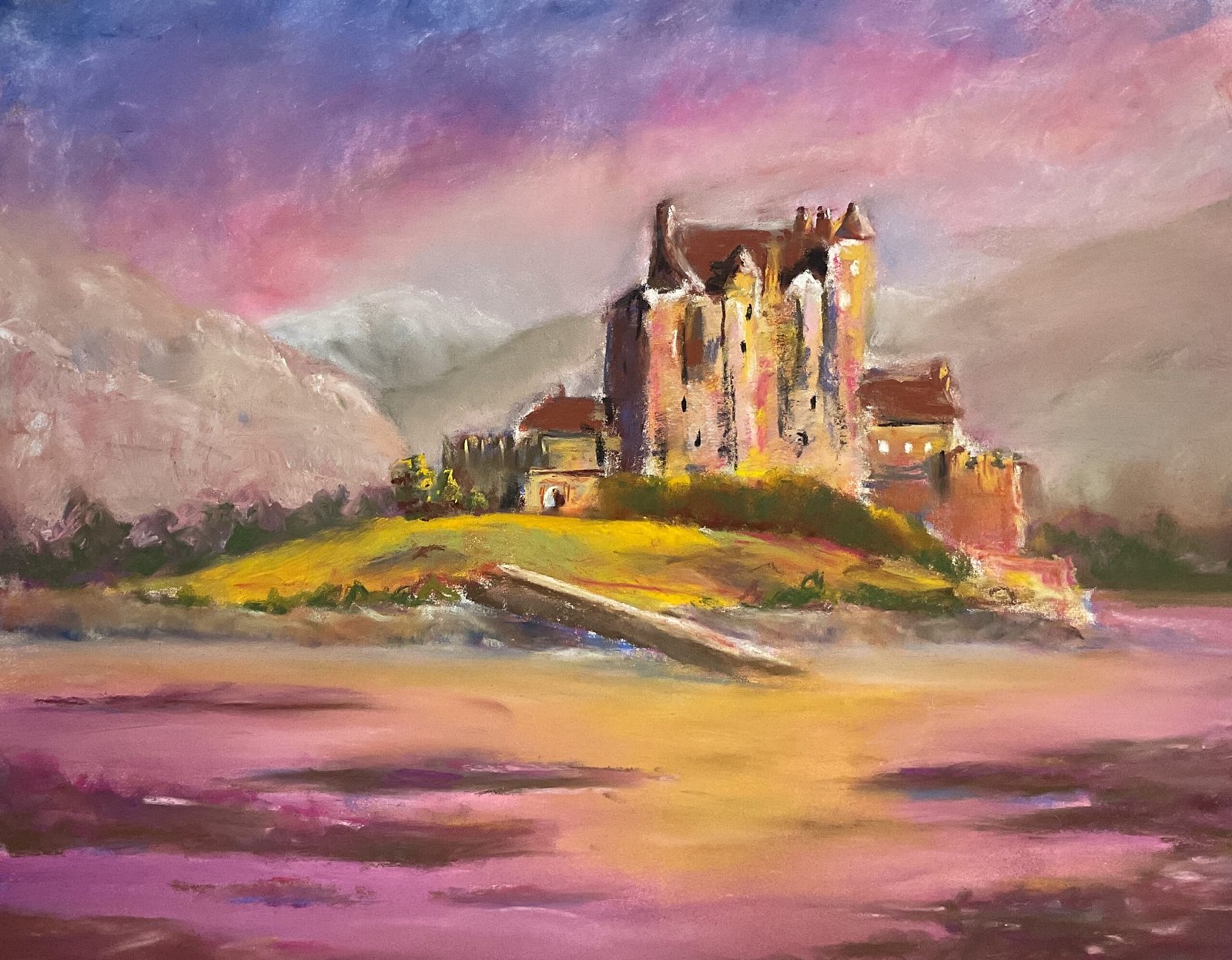
Back to soft pastel landscapes again, and to coming up with a set of submissions for Landscape Artist Of The Year. Looking through the huge set of source photos I’ve built up in the iPad, I found a great photo of a Kentish castle by the sea, with loss of purples and pinks in the sky and the sea. But rather than painting the castle in the photo, I thought I’d use the colours in the photo but in a painting of a Scottish castle by the sea or a lock. Googling around, I found this castle near Kyle Of Lochalsh and the bridge over to Skye.
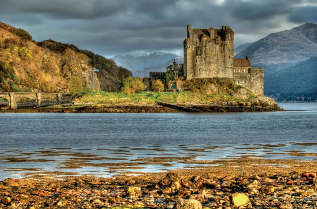
This one took me a couple of days because yesterday was interrupted by an appointment at the optician. Not necessarily a bad thing, as a break in the middle of the painting gives me time to muse on compositional and design issues. I was in great mood while pinging this one, singing along to Lynyrd Skynyrd yesterday and to Tom Jones today. Music is a great enabler of expressive painting. And this was an expressive painting. My source photo of the castle looked like this (!):
It’s worth mentioning some of simplifications I made in my painting. The bridge on the left was mainly cropped out already but I eliminated it completely rather than having something distracting out on the edge of the painting. I also decided not to bother with the flag s I wanted the castle to remain as the centre of interest. And I don’t know whether that’s two hills on the left or one hill with a cliff face but I’ve gone for one hill with no cliff face. I started with a cliff face but soon decided that the painting would be better without it. On the one hand, it’s great that I made that decision and that soft pastels are forgiving enough for me to be able to make changes in the middle of a painting. But on the other hand, it was a mistake on my part to initially include the cliff face: watercolour wouldn’t have let me make a change.
I worked from the back to the front in this one, the sky, then the hills one at a time, then the castle, then the land, then the foreground water. I put down thin layers of colour with the sides of the pastels and smoothed them out whenever it felt necessary, sometimes with fingers and sometimes (most notably in the sky) with colour shoppers, those rubbery things in sticks – I remember what they’re called today. Often after smoothing, I’d find that I needed to add more layers of colour. Not a problem.
For the hills, I started with cool colours in the most distant hill and then gradually warmed them up as I got closer. And then for the castle and land I had fun trying put all sorts of colours until I got to something I was happy with. Then I added all the tiny details to the castle with firm strokes using sharp edges of pastels.
Most of my work today was on the water and the mud flats. After that was done, I stepped back and thought about whether the painting was working. The castle was in very sharp focus and I decided to build on this by softening the top edges of the hills to get them out of focus. I think it this change worked.
And what I’ve ended up with is one of my better paintings. The colours are great; pink and blue go well together especially. The castle is in sharper focus than everything else, which really works well. And with less blue, pink and purple in the castle and that flash of bright yellow on the grass, it feels like the castle’s lit up by the sun through a gap in the clouds. Yes, this one’s a big success. This one is up for sale (with the price here).
It feels to me like I’ve “found my voice” in soft pastels.
<26 days later and I glance up at the telly and I recognise the castle that I see straight away. Turns out this castle features in Highlander.>
<22 January 2026 I’ve just seen this castle is the one featured in The Eagle’s Nest, the first New Avengers episode, a personal favourite>
Leave a Reply