


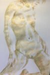
After that last painting, I wanted to have another go at painting Adrina in this…
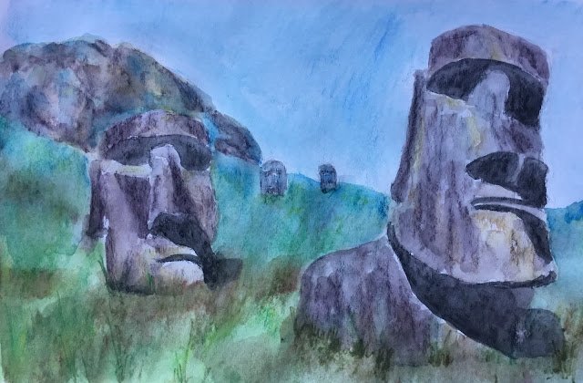
Easter Island
I might have settled into a rut. It’s quite easy to keep drawing naked figures with inktense pencils, shading in the shadows and painting over with water (important lines first) and leaving the odd missing edge. I can’t keep doing this forever. People will get bored.
So I decided I needed to draw something else. If I can’t draw real people, then my obvious next port of call must be statues, right? So I googled for statues in search of ideas and ended up at Easter Island. What I liked about the scene I found was the interesting shadow shapes (and interesting shadow shapes seems to be my thing in recent weeks). In this case, the shadows were not just interesting but also looked like sunglasses. So I had to give this one a go. It will also be my first landscape for a while and I need some landscapes up here for when the Landscape Artist Of The Year judges come calling.
I used way too many colours in this one to list. Mustard turned out to be quite a hero, putting those yellow highlights on the statues.
After my first attempt, I had two problems. One was that the rocks in the background didn’t contrast enough against the head in front of them. The other was that the heads stood out too sharply against the background. The first problem was solved by putting lots of blue in the rocky hill. The second was solved by going over the grass three more times, adding some darker grass at the front to anchor the heads (a green and red mixed well to give that neutral brownish colour) and making the grass at the bottom of the heads grow up in front of them to softer people the bottom edge. At the same time I added lots of blue to the furthest grass just to get away from the blue sky green grass colour scheme which I’m not keen on.
End result? Yeah, not bad. The head on the right is the best bit with the yellow highlights and the vertical lines adding some bulk. The colour scheme is still a bit blue for sky, green for grass. Maybe I should have made this a vignette of a pair of heads with very little background. The shadows on the grass are combined with the shadows on the head, which would normally be good, but the effect is spoilt by the hard edges on the shadows. In fact, hard edges are a general problem with these pencils and something I either need to find a solution to or allow for in how I paint. Compositionally, the big head looking out of the painting is theoretically undesirable but I think it works here because the eye moves in a spiral from the big head to the next biggest, then to the two in the background.
This was an interesting runout. It’s up for sale. To see the price, click here.

Leave a Reply