


This one's a 144 page paperback and is absolutely packed with ideas. While it's a…
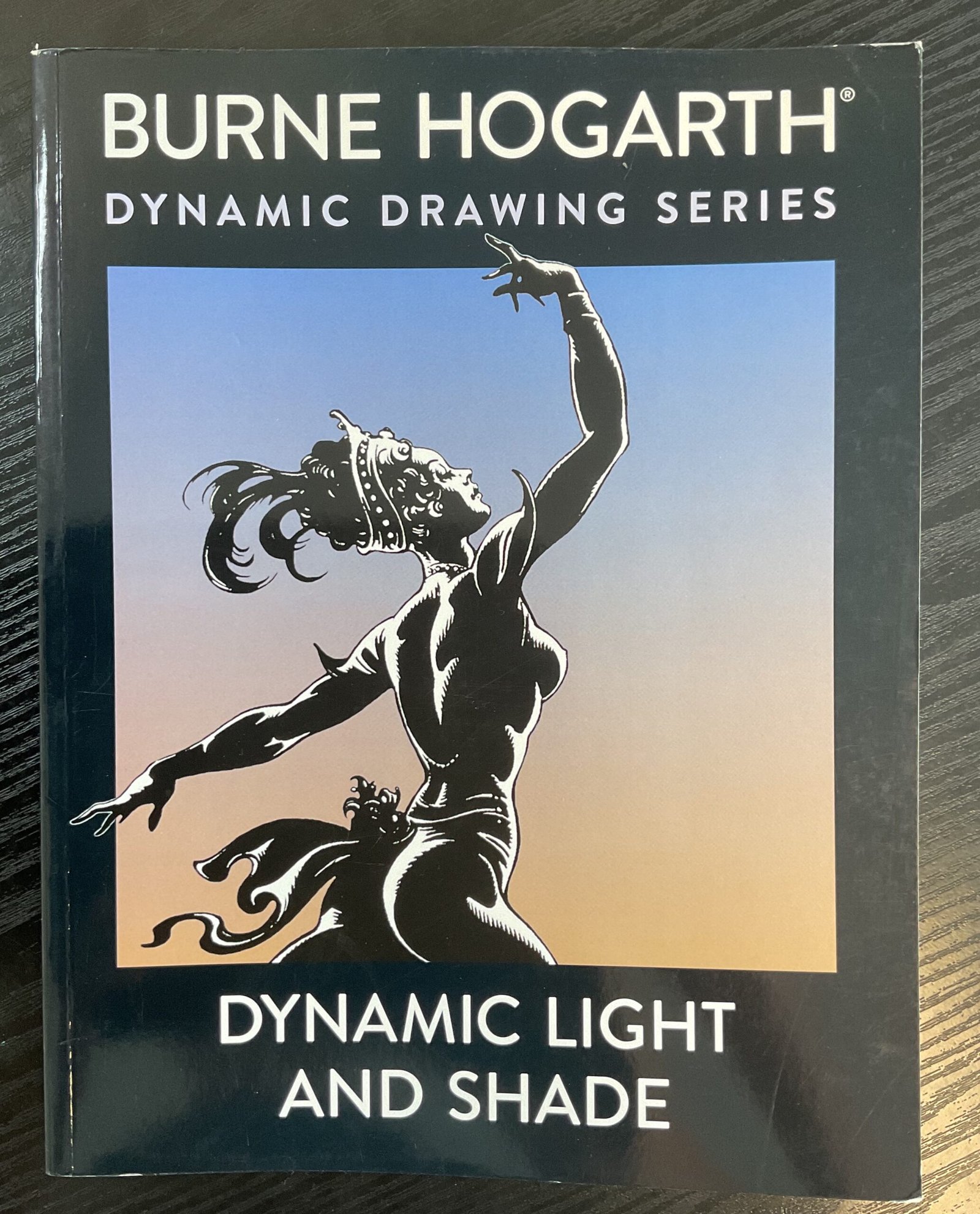
Dynamic Light And Shade, Burne Hogarth – Book Review
This is a book that I’ve had my eye on for a while. I liked what I’d seen inside the book, including the comprehensive looking contents page. And then last week the price suddenly dropped on Amazon and I was straight in there to order a copy. It’s a 160 page paperback. All in black and white, befitting the subject, even if some of the photos in here are black and white photos of what were originally coloured paintings.
Let’s go through that list of chapters first. We have fifteeen chapters:
- Silhouettes
- Minimal light
- Five categories of light and shade, being the the next five chapter headings. I’d argue moonlight is just a special case of single or double source but what do I know?
- Single–source light
- Double–source light, so that’s a lit up side with reflected light in the shadows on the other side
- Flat, diffused light
- Moonlight
- Sculptural light. This was new to me and very interesting. I won’t spoil it for you.
- Spatial light, a chapter on composition
- Environmental light. How to portray the time of day, time of year, weather using light.
- Textural light. How to show texture.
- Transparent light. So painting water, glass, etc
- Fragmentation light. Painting splashes, explosions, etc. This chapter a bit more suited to illustrating comics.
- Radiant light. Special case of single or double source when the source itself appears in the painting.
- Expressive light. Using light to set the mood or express a message.
So a pretty comprehensive list of contents, as I said. And I like it. It gives a sense of structure to the book, males everything look well organized.
Anyway, that’s the structure. What happens within that structure. Well, this book is a bit different. There’s no big body of text to read. We get an introduction at the start of each chapter or tell us what it’s about but often this is just one paragraph long. The rest of the book is filled with artworks (by others as well as by Burne) and every artwork has a paragraph of commentary next to it. The commentary is really insightful. It refers to individual marks and techniques within the works. My favourite comments are the ones that talk about how it looks like the light from a fire or that the figure is depressed or that the figure is indoors and that tell us how the artist created these impressions. The art itself is generally good. Lots of landscapes as well as figure drawing. Some looks like it’s been done in charcoal, some just in black ink. Some look like artwork or sketches, some like panels in a comic. I wasn’t a fan of the cave art or the Chinese art: neither felt as if they were of much educational value. My favourites were Burne’s black and white ink drawings, like the one on the cover. Reminiscent of that Charles Burns graphic novel, Black Hole, which I need to check out some time.
In an epilogue at the end, Burne talks about how the scope of the book might have widened as it went on. And, yes, it did. It went into composition and into mark making but this all felt close enough to the core theme of the book to still be relevant.
This book is definitely worth buying. I’d only recommend it, though, to someone that was already familiar with light and shadow from other books: it’s not an introduction to that sort of thing. You also need to have a bit of experience to be able to learn from commentary on paintings rather than reading big blocks of text or being taken through demonstrations. For me, it feels like a book that’s as much about inspiration as it is about teaching. In many ways it reminds me of the Bill Buchman book. And that comparison helps me with my final score. While this book is definitely worth buying, I find the lack of colour results in a level of inspiration that’s a step down from Bill’s book which scored, let me check, four palettes. So that’s it then. Burne gets three palettes which, let me remind you, is a good score.
🎨🎨🎨
You can find this book and more reviews of it at Amazon UK here. As an Amazon Associate, I earn commission from qualifying purchases but this costs absolutely nothing extra to you.

Leave a Reply