


I wasn’t very good at painting and not that committed to improving. I would have…
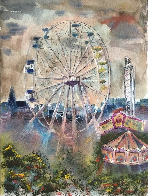
Dreamland Margate
I’ve been looking forward to this for ages. A day trip down to Margate to paint Dreamland, Margate’s funfair. With the fair still being closed for the winter, I couldn’t get in, so the best view was from the top floor of a multi-storey car park. But I shouldn’t complain because it was a wet and windy day, and I was able to set myself up and paint inside the car.
I picked a decent landscape view and put down a pencil drawing. Then I drew in the Ferris wheel and that tower with a D on top using masking fluid. For the thicker shapes, I painted on the mask with an old brush; for the thinner lines I used a mapping pen. This variation in thickness looked good.
Their was colour planning. My plan was to follow the methodology that I used for Rochester Castle with a warm green triad of rose dore, cerulean blue and transparent yellow used for most of the painting (including lots of low lying fog) and then to stab in some sharply focused foreground foliage with green apatite genuine, cadmium yellow highlights and the odd bit of cadmium red. I started out following the plan, with a sky made up of cerulean blue and rose dore. I forgot to bring any kitchen roll but the paint I mixed was watery enough to give a low enough value. The blue was granulating really well too.
But the pen I started diverging from the plan. The next shapes to be added were the distant buildings and the two colourful stands in the bottom right. For the distant buildings, I reached for the Prussian blue because of its staining properties, making it hold it shape if I wanted to wash some fog in front of it. For the stands, I used the cerulean blue, Prussian blue, transparent yellow and rose dore. I also used a bit of quinacrinone magenta in an attempt to match the real life colours. I then had to add some of the magenta to my distant buildings to balance the painting. I think I also put in a bit of Winsor red in places too.
Next was the fog but first I removed all the masking fluid, Then I went to to town with the cerulean blue, rose dore, Winsor red and transparent yellow to crate the fog. The yellow added a nice glow to suggest there was something going on down there.
The I added some colour to the Ferris wheel. For the seats, I used some randomly mixed paint from my palette rather than trying to exactly replicate the colours in front of me. For the wheel itself, I
I liked the colours at the bottom behind the fog. Higher up, and for the tower, I added some blues and violets because white is never enough.
Then I stabbed in the foreground greenery using quite dry paint. First the green apatite went down, then some cadmium yellow highlights at the top of leafy shapes, then some cadmium red spots. This worked well again, maybe even better than for Rochester Castle as I remembered to leave empty spaces showing the fog behind the trees. I also stabbed in (rather than spattered) the cadmiums in other places and added the odd bit of yellow to the buildings to look like indoor lights.
I still felt something was missing, so added in some outlines using a black rollerball pen. I think this worked. Not a huge improvement but maybe a slight one.
And then I went wrong. I thought that three birds in the top left corner would round things off. I tried to paint them in three different colours: cadmium red, cadmium yellow and French ultramarine. I should have practiced first on scrap paper as I wasn’t happy with the shapes, especially the red one. I tried correcting the red bird several times, the bird getting bigger each time, eventually conceding defeat.
With the painting being a write off, there was no harm in tinkering. So in an attempt to blot out the birds, I mixed their three colours together and used this mixture to paint over the the sky a couple of times. With two of the three colours being opaque, this not only meant that bits of the Ferris wheel would be obscured, it also meant that the sky colour would be quite muddy.
So here it is, the final result. Bits of it are good but some of them are most definitely not. In particular, the remains of the red bird are still visible in the top right and the two fair stands are too distracting. The fair stands should either be less focussed or more neutrally coloured, maybe both. On the other hand, this one was really popular in a poll, so I’ve put it up for sale.
Leave a Reply