


And now for something completely different. A book that can't be read. This isn't a…
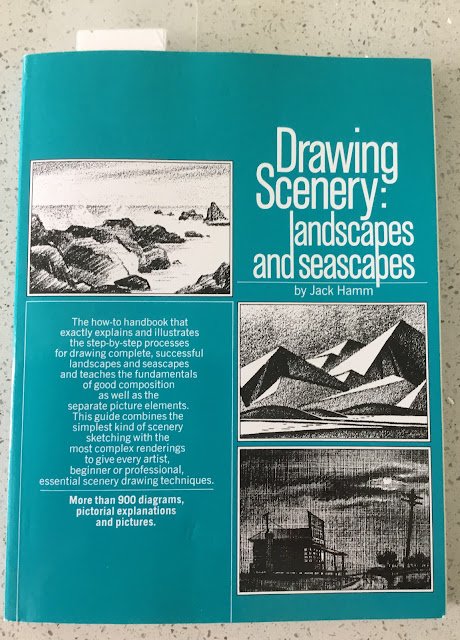
Drawing Scenery: Landscapes And Seascapes: Jack Hamm – Book Review
This is the third of the classic Jack Hamm books in my collection. There’s a fourth one out there on cartooning that I won’t be bothering with. Before we go on to content, let’s talk about the physical book. It’s a 120 page paperback. It’s all in black and white, as expected, and, to be fair, it’s about pencil drawing so a colour version would be like watching High Noon on a colour telly. Also vaguely expected but still disappointing, the quality of the images and the (Times new Roman font) words are a bit scratchy. But worst of all is the quality of the paper in the book. Billy Wilder once described France as a the country where the currency falls apart in your hands but you can’t tear the toilet paper. Well, the pages in this book are probably like that currency. It’s like newspaper. Here’s a photo:

I also noticed the cover of my version is a teal colour whereas the cover on Amazon is more of a French ultramarine. Maybe there are ultramarine coloured versions of this book in bookshops with proper paper between the covers – keep your eyes open.
Anyway, let’s talk content. We have something like:
– 40 pages on composition
– 15 pages on trees
– 15 pages on rocks and mountains
– 20 pages on clouds and skies
– 30 pages on water
The stuff in composition was really comprehensive. Most of it was stuff I already knew but it was presented differently to what I’d seen. Other artists talk about this stuff by showing us complete paintings and picking out eye paths, centres of interest, etc but Jack shows us really simple drawing, made up of just a handful of lines. Being a scientist at heart, I appreciated this simplification.
The section on tres was great. Drawing trees is different to painting trees. When someone like Terry Harrison talks about painting trees, he talks about simple cookie cutter techniques that are fine for trees In the background. Drawing trees required more attention to detail and the tips in this book (like putting some foliage behind branches and some in front) will definitely help my painting.
The rest was less useful to me. The stuff on rocks and mountains was generally stuff that I’d already discovered for myself. I’ve never needed to draw clouds before, so wasn’t too interested in that chapter,apart from some interesting stuff on how to make clouds contribute the composition, te although I may take another look if I start painting landscapes in coloured pencil. The section on water with all its stuff in waves and reflections was good but was never going to be able to compete with the Ron Hazell book.
In a couple of places (I think it was in the composition and rocks chapters) there was some interesting stuff on how to create imaginary landscapes by following simple processes. There was an example with a valley with loads of spurs sticking into it and another with a mountain. Other books only seem to talk about real world landscapes, albeit sometimes using artistic license to add or remove features or to combine together multiple photos.
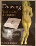
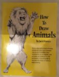
The writing style was still a bit clunky and I didn’t detect much passion coming through (understandable as this book is now 50 years old). Compared to the other two Hamm books in my collection (on drawing people and animals), this did feel more like a book than a car manual. Things seemed to hang together a bit more.
It’s definitely a book that was worth going for and that I’m glad is in my collection. But the old fashioned style drags it down a bit and leaves me somewhere between three and four palettes. While I was determined to not deduct palettes for the terrible paper and scratchy illustrations, I’m quite happy for them to settle whether to round a half pallets up or down. Three palettes it is.
🎨🎨🎨
You can find this book and more reviews of it at Amazon UK here. As an Amazon Associate, I earn commission from qualifying purchases but this costs absolutely nothing extra to you.
Leave a Reply