


At the time I bought this book I was only painting landscapes and my artwork…
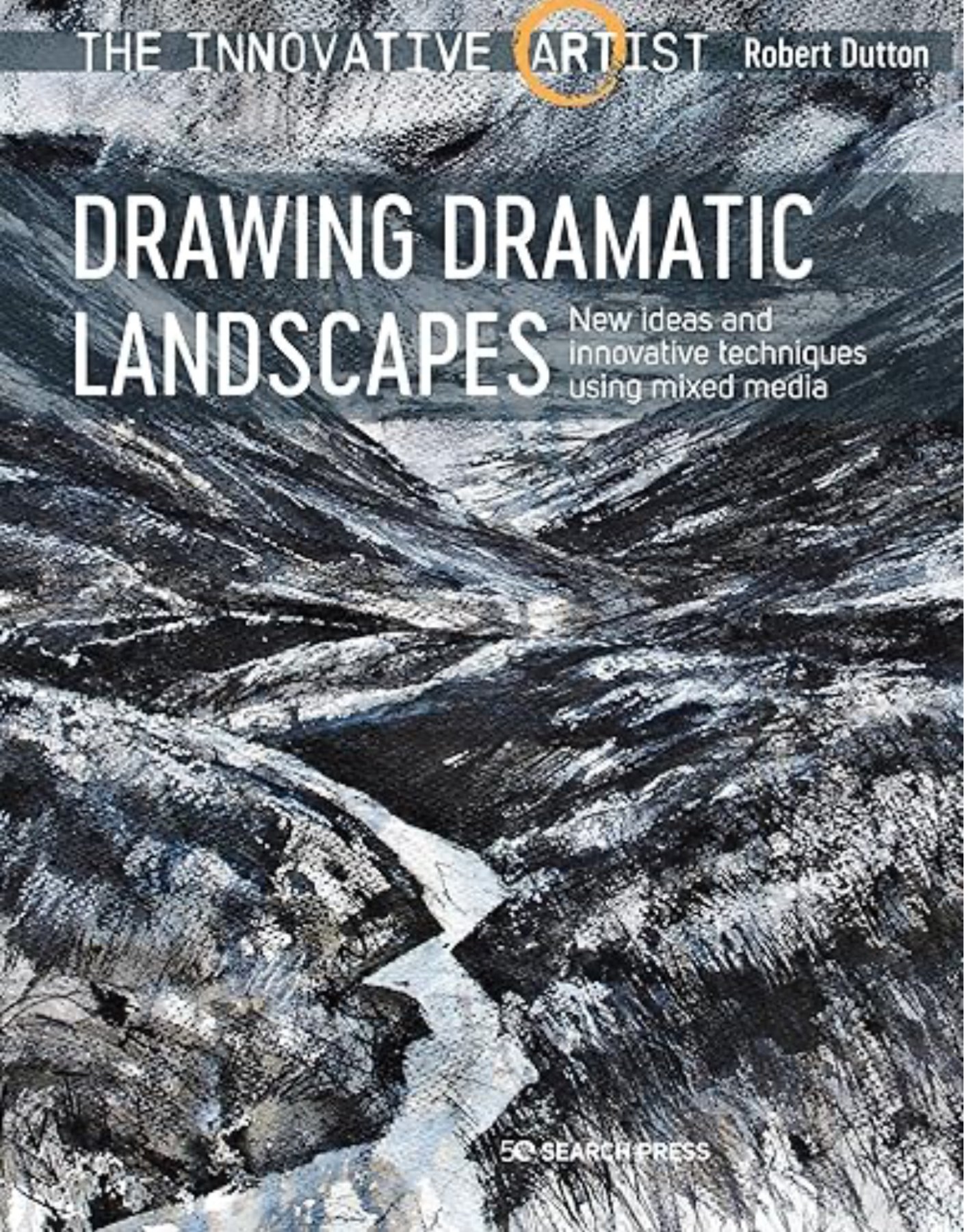
Drawing Dramatic Landscapes, Robert Dutton – Book Review
This book’s been offered at quite a cheap price on Amazon for a while now, so I thought I’d give it a go. I was attracted to it by Robert’s artwork, a style that would be good to have in my weaponry. I was aware that Robert’s main media were graphite and charcoal but that he also used other media. I was hoping that some of the ideas in the book would work with charcoal, soft pastels or Artgraf blocks.
The book is a 160 page paperback, issued by Search Press, one of those paperbacks with oversized covers that are folded inwards so don’t go out of shape at the corners. Thick shiny pages. It feels good.
Structure-wise, the book feels more like one long journey than a series of chapters but it can be broken down into:
- 25 pages on materials. There’s a lot of information here. Charcoal and graphite both come in so many different forms. Plain vanilla, pencils, powdered, wettable pans, liquid,…. There’s a lot of information here and anyone tempted to explore graphite or charcoal in depth is going to have a long Christmas wishlist after reading this. And that’s not a criticism: this is one of the more interesting sections on materials that I’ve seen. There’s also information on pastels, inks, paper and extra stuff (like gesso) that you can spread on paper
- 40 pages on painting with graphite and with charcoal. A nice simple start.
- 80 pages on mixed media painting. Graphite and/or charcoal are the main media but inks and pastels are strong supporting characters. Even gouache and oil pastel play fleeting cameo roles.
- Finally there’s 15 pages of even looser work, with a lot of paper being torn up and stuck back on.
There are lots of demos throughout the book but they’re hard to follow. With multiple media and multiple forms of each medium, these demos would have been more useful with 20-30 steps rather than 5-6. And some of the steps didn’t tell me much. Keep darkening the darks. Yes? Use a rubber to remove pigment and create highlights. OK? The knitting pattern brigade will absolutely hate these demos. The reader just needs to look at the photos and work out for himself what’s going on.
There are useful hints and tips in here but it didn’t seem like there were many. Or maybe lots of them went over my head because so many of the media forms used in the book are currently alien to me. Anyway, I didn’t end up making any notes on this book.
Robert has a voice. I fully get his passion for traipsing out into the wild and creating this artwork. But I did become a bit tired of having him keep telling me how exciting everything was: the views, the media, the artwork… I’d seen a video of him launching the book on YouTube and even in that video I got fed up with him telling me how excited he was. He needs to show us things that get us excited, not tell us to get excited. That’s how art instruction books work.
The artwork itself is fantastic. Just looking at it was enough to inspire me to try out some new ideas and that’s where this book’s value lies. I’ll have a go doing some landscapes using soft pastels the way Robert used graphite and charcoal. I will be trying out some charcoal landscapes in Robert’s style. I will be trying out acrylic ink underpaintings with charcoal on top. I will try pastels on top of charcoal. I might try Artgraf underpaintings with charcoal. I’m tempted to invest in some XL graphite blocks, a charcoal sharpening block and even a bottle of black Quink ink.
This feels like a three palette book to me, making it worth buying. It has inspired me and, yes, got me excited. The shortage of tips and rushed demonstrations mean that it’s not going to get a fourth palette. Even if I was highly experienced in graphite and charcoal, I suspect that this would still be a problem. Three palettes is still good though.
🎨🎨🎨
You can find this book and more reviews of it on Amazon UK here. As an Amazon Associate I earn commission from qualifying purchases but this costs absolutely nothing extra to you..
Leave a Reply