


I wasn’t very good at painting and not that committed to improving. I would have…
Domination
Back to painting today after a bit of a break for rain and football. I’ve done two paintings today but it’s been a while, so don’t expect a masterpiece.
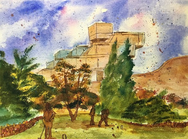
I’ve watched a couple of Ian Fennelly videos on YouTube recently and I like how he puts random colours all over inanimate objects like buildings and cars. He also has a way of doing this where he uses a small flat brush to push the paint against the bristles into the corners of shapes. I wanted to give both of these ideas a go (using an old brush for the paint pushing) so picked out a couple of photos of New Court from Christ’s College, Cambridge. It’s an ugly looking concrete monstrosity and ideal material for these new techniques.
For this first one,I wanted to contrast the ugly building against the amazing gardens, so used two colour schemes. The building is in cerulean blue, rose dore and raw sienna (the key of green warm). But the gardens are in French ultramarine, transparent yellow and quinacridone magenta (the key of purple cool).
First up was the sky in French ultramarine with a bit of rose dore, using the techniques form the Bridget Woods book. Ian Fennelly doesn’t seem to do skies but I always do.
Then. I underpainted the building in Ian’s style using the three primaries in that green warm triad and not worrying too much about which colours appeared where. This was great fun. Later on, I used those three primaries to mix a neutral that I used to add shadows on the building to start bringing out some shapes.
There’s not much to report about the foreground. For the trees, I tried something different. I used one of my special Terry Harrison rushes but rather than dib dabbing, which I usually do, I pushed the paint against the bristles, Ian Fennelly style. This worked well, so I think I should have been doing this all along. The neutral tone for the three figures was mixed using the three foreground primaries. And the garden wall used a bit of both the building and garden colour schemes – this felt like the right thing to do. There’s some cadmium red and cadmium yellow in the flower beds as I needed a bit of colour there.
I also did something else that Ian does and drew in some outlines with a black rollerball. Ian, to be fair, goes into a lot more detail with the outlines than I do.
And I spattered over some colour too: French ultramarine, cerulean blue, raw sienna and rose dore.
Final verdict? Not good. I like the building and how it dominates the scene and contrasts with the green trees in front of it. The spattering helps bring the painting together and fits with the generally sketch feel. The flowerbeds are very bad though – it’s not just the flower beds themselves but also the shape of the edge of the lawn that’s not right. And while the croquet player bending over on the right is OK (the rollerball lines help) the other two are pretty bad and the brown colour on all of them is quite ugly. So one for the reject pile.
The painting does look better after some cropping and I may well put the cropped version on Instagram/Facebook/DeviantArt:


Leave a Reply