


29 June 2018 And now a genuine abstract. What can I say about this one?…
DNA
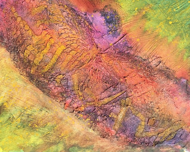
And here’s the second of the day. This is all out abstract. I cracklepasted a board a couple of days ago (with watercolour ground applied to the non-pasted bits) and stuck a satsuma net bag into the paste, just like I did for Stormy Abstract. This time, though, the bag was placed down the diagonal of the panting and I was careful to include the end of the bag where all the strands are brought together. It came out well.
My plan was to make the central band red or violet and the corners green or yellow – complimentary colours and all that. With plans to use a number of different colours, this wasn’t going to be painted in a simple key. I started by using acrylic inks bring out the cracks. Indigo, brick red and a bit of gold. I stayed away from sepia – this painting was only going to be based on primaries.
Then onto the painting. I was switching backwards and forward between the band and the corners, so I didn’t do this in the same order as described. The corners started with a glaze of Indian yellow, followed by a glaze of French ultramarine. The middle band was already looking a bit blue/violet from the inks so I started by painting it red. I used quinacridone magenta, rose dore and (for the first Time in a while) cadmium red to get a bit of variety. In places I painted French ultramarine over the top to get some purpley bits.
And then we get to the tinkering. I thought the transition between the band and the corners was a bit too abrupt, so used some quinacridone magenta to try to link the two together. But then the corners started to look a bit muddy, so I added in some transparent yellow to make them greener again. Eventually got to something I was happy with.
And then I thought the painting was a bit dull and needed a bit of bright yellow to bring it out of the hole it had dug for itself. I decided to paint some of the islands and valleys in the crackle paste in a warm yellow colour. I started doing this with Indian yellow but found it was too transparent and didn’t brighten the painting enough. So then I painted over that first attempt with cadmium yellow, which is opaque, so worked. These yellow bits look like some sort of strange writing or spider legs.
Finally, I wanted to brighten up the green corners, so spattered on some more cadmium yellow, trying to spatter it away from the central band and at a right angle to it.
And that’s how I got to this painting. My oldest son told me which way around it should hang (I was also thinking landscape format but the other way round). When pressed to tell me what it looked like, he told me it reminded him of Peter Parker’s DNA in a weird scene in the first Sam Raimi Spider-Man film, so that’s where its name came from. But it can be anything you want it to be.
I’m pleased with this one. If there’s anything that could be improved, I guess the colours could be brighter but that’s being picky. It’s up for sale and you can see the price here.
This painting has had wax medium applied to it for protection and still looks fine.
Leave a Reply