


Now this is more like it! A painting on an experimental surface that worked. The…
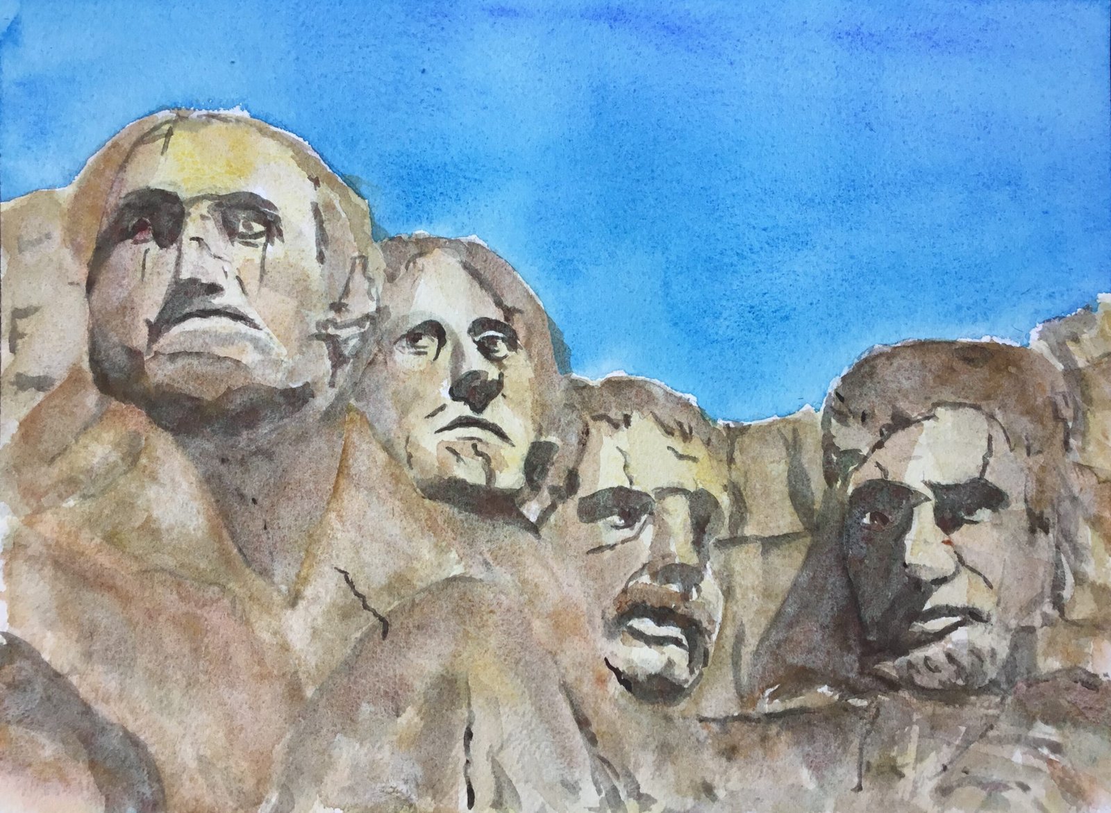
Disapproval From Mount Rushmore
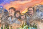
Another watercolour today. I wanted to have another go with the desert supergranulators supplemented with cool blues after they worked out so well last time. But I also thought that I should start having a go at watercolour portraits after reading a (not great, admittedly) book on them. So the subject’s a no brainer. I’m having another go at Mount Rushmore. Remember my first effort?
Colour wise today, the sky uses three blues: French ultramarine, Winsor blue (green shade) and cerulean. And everything below it uses four of the desert supergranulators (green, brown, orange and yellow). I didn’t use desert grey today. With the warm French ultramarine only being used sparingly, I think this counts as being in the key of green warm.
Obviously, with this one having portrait-like characteristics, I started with a grid and put down a really average pencil drawing my measuring exactly where all ten important points on the faces should be. I also marked out all the dark, shadowy shapes. I know it’s something the boom told me not to do but I don’t always do as I’m told.
The sky is pretty straightforward. French ultramarine in the top right for some violety warmth but otherwise Winsor blue GS at the top and cerulean blue at the bottom – remember that cold blues in the sky make the desert colours underneath look even warmer.
After the sky was down, I painted in all the darkest areas with desert green which, being a mix of red and green pigments is a pretty dark colour. Once the darkest bits were in, I watered the paint down and uses it to put in all the semitones, including those in the background rocks as well as those in the faces. At this point, the painting looked like this and I must admit I was tempted to stop here. But the wife told me to carry on.

While I remember, I should probably introduce you to the models. From left to right, that’s George Washington, Thomas Jefferson, Theodore Roosevelt and Abraham Lincoln.
So I carried on. I decided at this point that I wasn’t going to be using desert grey: desert green was doing fine on its own as a dark color, thank you very much. I also decided that desert brown, being semi-opaque would only be used in moderation and that most of my cliffside colour would be made up of the semi-transparent desert yellow and orange. So I started with a watery glaze of desert yellow, being careful not to disturb the desert green underneath it. And I dropped in desert orange in lots of places and desert brown in just a few. All my brushmarks were motivated by either shadows, colour balance or textural effects.
One of the things that the David Thomas book kind of told me that I used here was that you can tinker around with lots of layers in watercolour portraits, so I did a lot of tinkering today, along more desert colours over the top until I was happy with everything. I even used desert green, going over all my shadows fro: the first layer and adding some semitones by putting on watery desert green and dabbing it off quickly with kitchen paper. Kitchen paper also has the side benefit of creating even more granulation. And once I was happy with everything, that was me done.
And I’m so happy with how this one turned out. The cool sky and desert colours gave me the heat I was looking for and there’s some blue vs brown/orange clashing going on. The faces aren’t perfect like eases but I don’t care because there’s some personality coming through. And most of that personality is disapproval. Washington’s mouth being slightly too high making his expression look taut, Jefferson’s sideways glance, Roosevelt’s disgust and Lincoln being disappointed and close to tears, it all adds up to a Story and makes it easy for me to name this one. And, dare I say it, I can’t see anything in this one that I don’t like. A successful day in the studio today.
This one’s up for sale. To see the price, click here.
Good to see it getting a reaction from Mark Hector on YouTube too 😂


Leave a Reply