


I thought it was about time I did something more conventional. Nothing abstract, no acrylic…
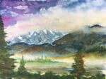
Denali National Park 2
Still making my way through my pile of new art supplies and today it’s a first outing for my Schmincke supergranulating tundra watercolours. They came as a set of five:
– tundra green is a mix of pthalo turquoise and Mars brown
– tundra blue is a mix of French ultramarine and raw umber
– tundra violet is a mix of French ultramarine and Mars brown
– tundra pink is a mix of French ultramarine and potters’ pink
– tundra orange is a mix of yellow ochre, potters’ pink and raw umber
All five, if put if put in rough enough paper in the right consistency will granulate and divide up into separate colours.
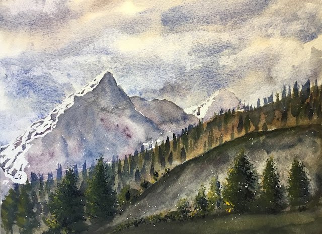
As you can imagine, I’ve been looking forward to trying these out. I spent some lazy time this morning searching for tundra photos on the internet that would give me the opportunity to try out all of these colours. I found five or six photos, settled for this one of Denali National Park and saved the rest away. It’s the second time I’ve painted a view in this park and the first one turned out pretty well.
I sketched out a rough outline and then masked out the snow in the hills. I added a spatter of masking fluid, being careful not to put any on the sky. I thought this might add to that wilderness feel in a glowworm sort of way.
And then I added on the colours from top to bottom. The sky has the blue and the violet. The hills used the blue, violet and pink in different places, being allowed to run together. And the foreground used all five colours at times. I was never really happy with the foreground and ended up applying several coats, which is why the granulation is less evident here. I wanted to make the foreground mainly orangey but the tundra orange is more like a brown than an orange, so I added in more colours. The green was annoyingly opaque at times, not letting the colours around and behind it shine: it’s my least favourite of the five.
After adding the ground shapes, I finished by putting in the trees. I tried using the green and the blue but wanted my trees to have a bit more life to them (quick aside: one of the features of tundra is that trees don’t grow there) so reached outside the supergranulating for a yellow. I tried transparent yellow first but it was stifled by the tundra green so I had to go nuclear with the cadmium yellow instead and this seemed to work. The closest trees look really good and I’m very grateful for this: without their voices, the painting would be let down by all those individual tree marks in the middleground. But with those foreground trees, everything hangs together.
My overall verdict is that this one’s a success and will be put up for sale. That’s despite me not getting the best out of the supergranulators. To see the price, click here.
And my verdict on the tundra supergranulators? The blue, purple and pink are amazing. The orange is OK and the green seems weakest, at least for the moment. But I can make better use of these colours. I need to apply thinner coats of paint, resist the temptation to glaze multiple layers and find something to do with the green. The green wasn’t designed for trees and I need to find something else that grows in tundra regions that has a bit of chlorophyll in it.
Leave a Reply