


Still making my way through my pile of new art supplies and today it's a…

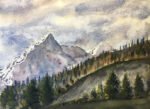
Denali National Park
I thought it was about time I did something more conventional. Nothing abstract, no acrylic inks, no salt. Just a plain simple landscape. And I had a scene of an Alaskan National Park sitting in my painting ideas folder, so I went for it and here it is.
The main triad of primaries today were transparent yellow, Prussian blue and quinacridone magenta. The first two were chosen because there was going to be a lot of green in the painting. Quinacridone magenta always seems to get into my paintings. It’s a cool (purple) red but it’s my only truly transparent red. I really need to find a warm transparent red at some point, maybe as a replacement for light red, which is struggling to justify its place in my palette, what with burnt sienna sitting next to it. There’s also some burnt umber and raw sienna in there.
I’ve used two ideas from the Gordon MacKenzie book here. The first is the atmospheric fog. The second is the alternating gradation: the sky and foreground are darker on the left and the middle ground is darker on the right. I think both turned out OK. And throwing some red into the sky also turned out well.
I’m happy with this overall, although there are things that could be improved on. There are some sharp edges in the sky, for example. And, on the mountains that are furthest away, the (low value, yellow) burnt umber stands out too sharply against the Prussian blue washes underneath it.
This one has been given away as a birthday present to a high powered research scientist in Los Angeles.
Leave a Reply