


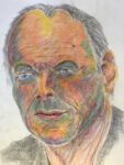
Back on the coloured pencils and I thought I'd try doing a portrait of David…
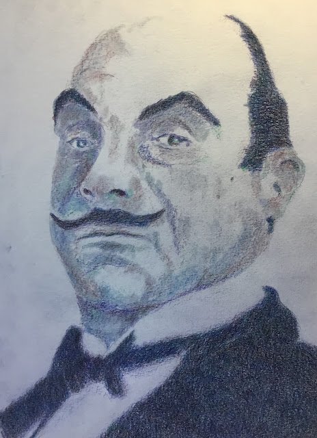
David Suchet
It’s still too cold to be out painting, so I’m indoors with the coloured pencils again. And, to be honest, I could do with having more portraits near the top of the blog (and pushing Stuart Broad off the bottom) just in case Portrait Artist Of The Year judges are looking. Hi guys! Ignore what I said about Stuart Broad! And I do need to start doing some timed portraits if I’m not to embarrass myself on PAOTY if I’m to make it to Battersea.
Poirot was on the telly in the background at one point yesterday while I was reading a book and he’s been stuck in my head since then. I googled around this morning and found a source photo of David Suchet as Poirot that was in black and white and almost chiaroscuro like. I especially liked the lost edges along the top front of his head. So that inspired me into doing this painting.
After having so much fun on the Moeen Ali painting applying multiple layers of colour in the beard and the background and ending up with neutral colours that, when examined closely, we’re made up of marks from lots of individual colours, I thought I’d try something similar for the darkest areas in this one. There are four colours in there: delft blue, dark pthalo green, dark red and helio blue reddish. I just started with the blue, green and red that were screaming out most to me, then thought that the resulting colour needed more blue, so added that second blue. After this, I was so happy with the resulting colour that I added one more layer of each of the four colours rather than introducing new ones.
The tache, eyebrows and hair also had two layers of these four colours applied but in the second layer of each colour, I was trying to introduce some hairy textures rather than just making the colours deeper. And for the colours in the face, I just used those same four colours again: this painting uses only four colours! In several places on the face, I was using the pencils edge on and trying to sculpt the shape of the head.
When this was all done, I had something I was happy with. But rather than stop there, I smoothed out the colours with a paper stump. It didn’t make things any better but, more importantly, it didn’t make things any worse either.
And I’m really pleased with the final result. There’s the likeness, the lost edge along the top of the head and a blurry lack of focus around the dinner suit that makes this look like a very old photograph, adding a 1920s feel that a TV director would kill for. This one is up for sale. To see the price, click here.
Oh, and timing-wise, this took two and a half hours with a couple of short breaks, which bodes well for any future appearance on PAOTY.

Leave a Reply