So, yeah, tonight was the night to christen the art studio. But, what with one…

Daniella
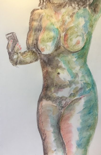
I would have been back on the watercolour today but there were various things breaking up my day and watercolour requires a bit of focus so I thought I’d carry in with the inktense pencils for another day. Today’s model is Daniella, making her debut on this blog.
Colour-wise, I initially started with bark, willow, baked earth and leaf green with the intention of using these (in that order) as four values and of working from a black and white photo. Before adding any water, I decided that this looked a little boring, so added some chilli red on the left facing surfaces and teal green in the right facing.
Then I added the water and learned some lessons. Bark’s value is far, far darker than willow, so they can’t function as the two darkest colours in a painting. If I have bark as the darkest value, the next value needs to be lightly applied bark. With anything else, there’s too big a step down. And baked earth, which I always think of as a burnt sienna type brown is more of a yellowy orange. The baked earth in this painting was dominated to hell by the bark and the chilli red. It needs to be given space to shine. And I need to stop thinking it as an earthy neutral and start thinking if it more as an earthy orange, closer to the outer rim of those colour wheels that have primaries around the outside and earthy colours towards the middle. And teal green can be a bit garish, so only needs to be applied in moderation.
So, after waiting for the first coat to dry, I added a second. I added a light touch of bark to the edges of my bark shapes in an attempt to blend them into the lighter values. I put some (cool, I greenish) sea blue on top of the teal green to try to bring it back towards normality. And I may have added a bit more of the chilli red in places.
The result is OK and this is going up for sale. To see the price, click here. The biggest lesson from this, though, is that bark might be better in monotone paintings rather than as the darkest value in a colourful painting. And I’m starting to like how chilli red and teal green work together – they’re probably opposite each other on the colour wheel.


Leave a Reply