


I didn't stay away long. I'm back to paint Inverie again, this time using the…
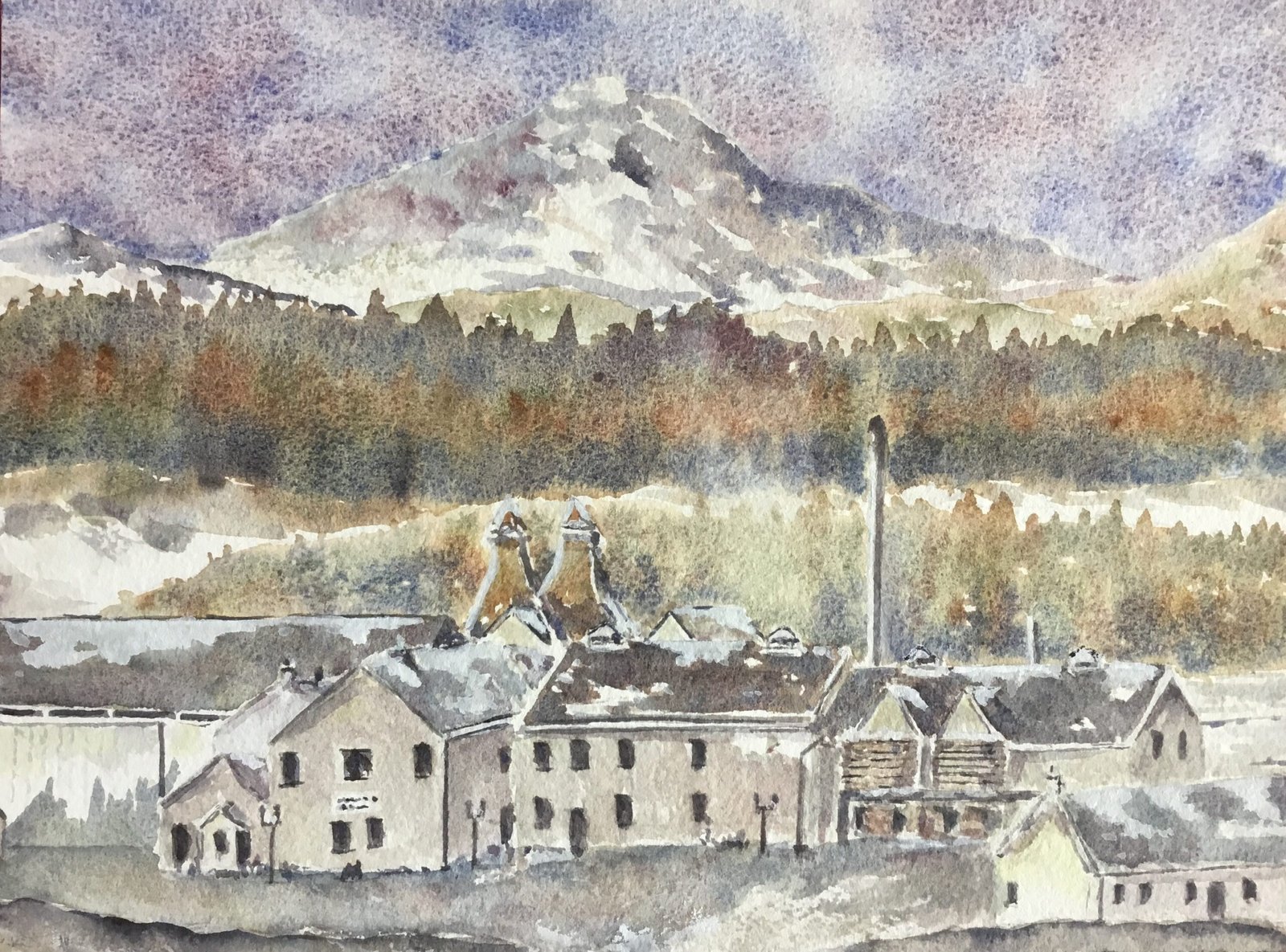
Dalwhinnie Distillery
It’s the weekend and the builders are off for the weekend so I’m back in the studio for a couple of days. What to paint though? Well, I can’t believe I didn’t think of this before. I was enjoying a malt last night and found myself googling the distillery to find out where exactly in Scotland it was from. Well, it turns out that the Dalwhiinie distillery is slap bang in the middle of the Grampians with a huge mountain towering over it from behind. I found a snowy photo that looked ideal for the tundra supergranulators and that was my Saturday sorted. This won’t be the last distillery I paint. There are so many distilleries in Scotland that I’ll never be short of ideas, in particular for ideas about how to use the tundra or even the Shire supergranulators. There’s going to be one rule though. I can only paint a distillery if I was drinking its whisky the night before. That already rules out painting distilleries on Tuesdays, Wednesdays, Thursdays or Fridays. With four more malts in the cupboard (besides the Dalwinnie Winter’s Gold), I have four distilleries to choose between for tomorrow.
Anyway, today’s painting uses mainly the five tundra colours, along with titanium white and a little bit of transparent yellow. There’s too little red in there for me to be able to designate a colour key to this one. With a load of coniferous trees in two big bands in the background it was tempting to introduce forest brown and green apatite genuine but, no, I wanted to just go with the tundra colours
Being a bit out of practice, I used a grid to do the drawing and had to resort to measuring distances with a ruler but I got there in the end. I reserved a few highlights with masking fluid and then I was ready to go.
Unsurprisingly I worked from top to bottom. The sky was looking a bit too dark so I blotted off a lot of the paint with kitchen roll and was happy with the result. The hills were what I’d been most looking forward to, as I’d seen how David Bellamy can include oranges and greens in his snow colours and still leave things looking cold. The hills worked out well.
Then there were the two bands of trees. These were where I had the most fun. In the source photo, I could see an orange band through the middle with greens just above and below it and with blues and dark colours below it. So I wet the whole band and stabbed in little bits of all the Tundra colours to diffuse wet to wet and to create the bands. When the started to dry, I tried dropping in tree shapes: blue and purple at the top and bottom and green and brown in the middle. I think it worked. The lower band of tres was much greener in the source photo but I still made sure to include loads of blues and browns.
Then I came to the buildings. At first I tried replicating all the colours in the source photo and seemed to do OK. All the windows and darkest shadows were in tundra violet. I added a tiny bit of transparent yellow to the most sunlit walls to try to create a tiny bit of warmth. Most of it I blotted off but there’s still enough there to brighten things up. Once the buildings were done, I coloured in all the snow in the foreground, having loads of fun dropping in weird colours.
And then I took a step back. There were some compositional problems with the painting but these were easy to rectify by diverting from the source photo. The building on the left has plain white walls and a white roof in reality but these stood outvote much against the rest of the painting, so I darkened the roof and added some squiggly vertical lines to the wall. There was also a blue balance problem, with lots of blue in the sky, the hill and the trees but not much in the buildings, so I unified all the rooves with a thin blue glaze, then went over the walls of all the buildings except the leftmost and rightmost with a thin glaze mixed from a number of colours but with enough blue to balance the top and bottom of the painting.
Finally, after removing the masking fluid, I added some snow tongue rooves in titanium white (always part of the plan) and went around tidying edges and shadows. And that was me done.
And the result? Mixed. The supergranulators absolutely did their job and the sky, hills and trees are nigh on perfect, at least by my standards. The buildings bring things down a bit though. The white snowy edges along the left sides of the two towers are just too crude with their fixed widths. And the buildings themselves, just like those in many of my paintings, look a bit too tentative and shaky, with my draftmanship skills letting me down again. Still, this is good enough to go in the shop window and might attract some interest.
Leave a Reply