


Someone in the village asked me if I'd be interested in painting her house. I…
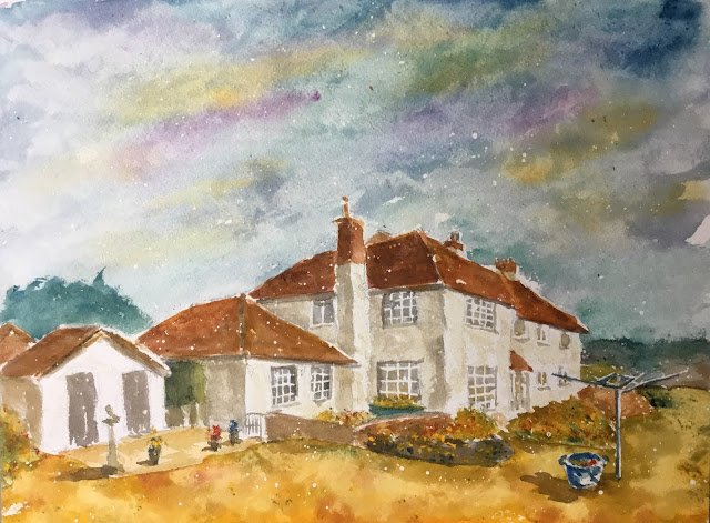
Cuckoo Orchard, Hartlip
Somebody in the village approached me the other day about painting his house. We had a good long chat and I think he gets what my artwork is about. In particular he was keen for me to paint his house but to make his clothes line the star of the show. That sounded good to me as I’ve been making trees and road signs the stars in a number of paintings with houses as the support acts.
Compositionally, I moved the clothes line from its normal position in the garden to a position closer to the spotlight. Not one third in and one third up but as close to that position as I could get. And I planned to have lots of dark/light contrasts in that area. The house is quite long, so I’ve chosen an angle where I can get most of it in. Even then, it occupies quite a narrow band in the painting. Putting the house straight through the middle of the painting is a compositional nono, so I had a choice of whether to go for a big sky or a big foreground. I went for the big sky as I’m more likely to end up with an interesting sky than an interesting foreground.
The main three colours today were Prussian blue, quinacridone magenta and Indian yellow. I chose the first two because they’re cool colours and cool colours in the shadows will make the light feel warmer. I opted for a warm yellow rather than a cool one, though, because a cool blue and cool yellow would scream green too loudly, which wasn’t something I wanted to do today. Anyway, this means that this painting is in the key of triadic left. Viridian also appears but only in the sky and mixed with the magenta in some of the darks. And the usual three opaques (cadmium yellow, cadmium red and cobalt blue) all made an appearance at the end.
The only textural special effects today were the initial masking fluid spatters, which I’m becoming increasingly addicted to, and some dabbing with a paper towel in the foreground and sky (and didn’t they work out well?). There’s also the odd drip of paint in the sky, but that’s just evidence of authenticity.
Highlights of the painting are the sky, the washing line and the little bits of opaque colour that, when added at the end, provided some much needed colour. I even used the cobalt blue in the washing line and clothes basket as the opaques seemed to be “coming into focus” more than the transparent colours. I also like the foreground, even if it makes the lawn more yellow than it is in reality. Bringing everything together, this is a scene from a really hot summer when the sun is shining but there may be thunderstorms later in the day.
The only thing I’d change I’d I were to do this again would be to leave out that green tank between two of the buildings – it adds nothing to the painting.
And there you have it. I’m happy with this one. The home owner was too: he’s bought it.
Leave a Reply