


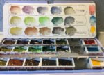
So I've done a huge swatch of those Polychromos coloured pencils and here it…
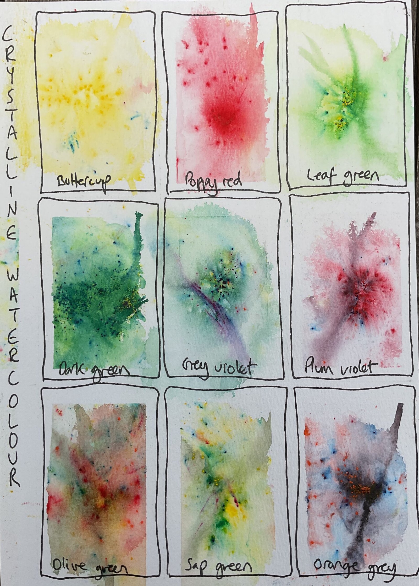
Crystalline Watercolour Swatching
Looks like today’s going to be a swatching day. I started with the crystalline watercolours. These are made by Jackmans and are only available through their own website or through platforms like Etsy.
They’re sold in sets of five and most (but not all) of them individually. There are three sets of multiple pigment mixes and one set of individual pigments. Having seen some of the mixes, there was no way I’d be going for the individuals. I went for set one. (The first five colours shown here) and supplemented them with two each from sets two and three. I think I’ve ended up with the nine most interesting mixes.
The paint itself comes in little bottles of crystals. For the switches I sprinkled on just a few tiny crystals, sprayed them with water, watched them do tricks and then tried to create tree trunks by running a brush through the mixes. I’ve seen people online use these crystals by pouring them into a well, stirring them with water and then painting with the boring flat colour that results. That’s just madness.
I can’t help feeling that these swatches don’t do the crystals justice. I think they’ll work better when given room to spread out and breathe rather than being restricted to one ninth of the page. I’ve also messed up in a few places by letting crystals bounce away into the wrong rectangle (there shouldn’t be any blue pigment in the buttercup swatch), letting paint overflow into adjacent rectangles before thought of putting down masking tape), sprinkling in too many crystals (in the dark green) or too few (sap green).
Still, it’s clear the potential is there for either flowery foregrounds or moody forest backgrounds. These crystals will be a cheat code for generating great paintings through my imagination with less skill than normal. Watch this space.
Leave a Reply