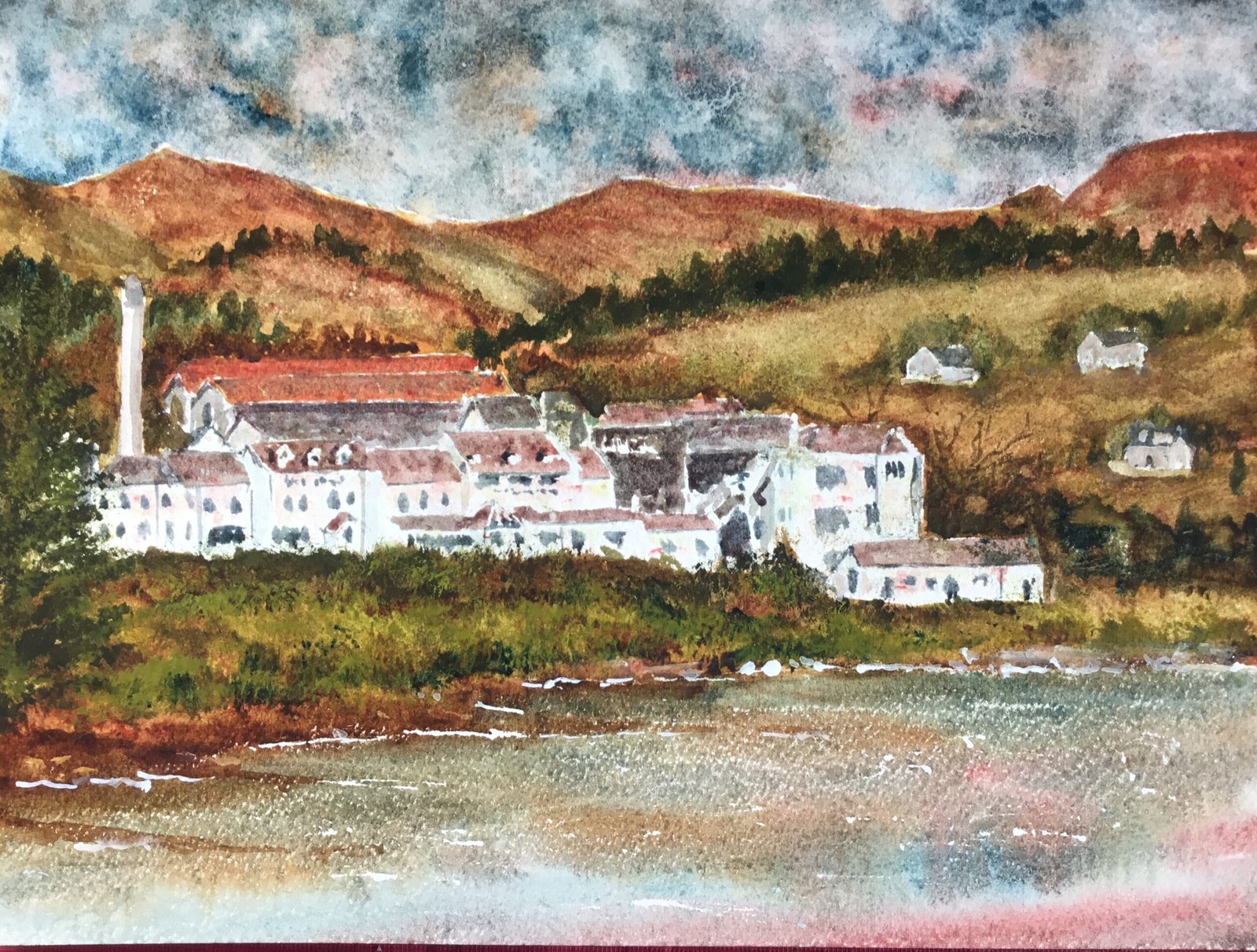
Spin The Wheel! Last night I relaxed in my recliner chair in front of the telly (but reading a book) with a Jura malt that had been stored in old pale ale barrels and, towards the end, diluted with saliva, reminded me of the frothy bit at the bottom of a beer. Better than it sounds actually. My choice of tipple was based on me wanting to paint the Jura distillery today. Rather than just painting the distillery, though, I think I’ve painted the whole of the villa of Craighouse, including the Jura Hotel and loads of residential properties as well as the distillery. I had to do this really, just to bet the hills and the water in. I couldn’t swear to it but I’m guessing those three hills at the back are The Paps Of Jura.
I went back from supergranulators to my main palette today as it would be too easy to keep using supergranulators and to never develop as an artist. For my red and yellow, I picked rose dore and raw sienna respectively, perfect colours for the reds in those hills. I picked Mayan blue genuine as my blue only after looking through swatches of the triads of all four of my regular blues with the red and yellow I’d chosen. I introduced transparent yellow later as a fourth primary. Being another cool yellow like raw sienna, I was still in the key of green warm. As well as these four, I was using burnt umber and green apatite genuine as key colours, the brown for earthiness and the green for trees. And I used some cadmium yellow and titanium white for some garnishing and tidying up at the end.
The starting drawing was all by hand today, without using a grid. It wasn’t perfect but it was good enough and felt better. I masked out the edges of the white shapes, not to preserve highlights but to keep my darker colours from intruding into the white shapes. I masked out a few ripples in the water and applied some wax resist (with a candle) mainly to the water but also to the hills, creating a bit of texture.
The first shape to be filled in was the sky. I used Mayan blue, burnt umber and rose dore, working wet I to wet. I must have applied three different layers, never really being happy with the result. In the end I dropped in some water to create cauliflowers, then dabbed off a lot of the colour to lighten things up.
Next I moved onto the everything else except the buildings. For the land shapes, I started with a layer of raw sienna, then dropped in the green, blue, brown and red wherever I could vaguely see those colours in my source photo. And then I painted in the water, using similar colours to the sky. I wanted to get the water in early while I could still remember how I did the sky.
Then I went back to the land, adding two or three more layers of colour and making the shapes more accurate as I went on. I worked hard to sculpt the hills, letting my brush slide down the hillsides. For the trees I used the blue, the brown and the green wherever I could see them in the source photo. I introduced the transparent yellow. Even then, things weren’t right, so I added some grass with a Terry Harrison brush and some cadmium yellow for its opacity. With the cadmium yellow on the page, it was easy to add more grassy strokes with the blue, the brown and the green. I also tinkered around with the edge of the water, adding some quite thick brown to the banks.
The three houses on the hillside were looking like they were floating in space for a long time, even after I created hillsides for them using transparent yellow. Eventually, though, I messed around and found an accidental solution, putting in some transparent yellow based colours for t( hillside, then wiping down the side of the hill with kitchen paper to sculpt the shapes of the hills. An interesting technique that I need to remember.
And then, after removing the masking fluid, I was onto the buildings. I wanted to keep things simple today by just painting in rooves and some very rough doors, windows and drainpipes. The idea was to use one colour for the dark shapes and three colours for rooves. I mixed up roof colou4 as close as possible t9 what I could see, painted these on and added the doors and windows.
And then I stepped back, spitted some problems and corrected them. I seem to be doing this a lot lately and it’s a good sign. The first thing I noticed was that my roof colours weren’t working. In particular the big orange rooves at the back were blending too much into the background and not looking part of the village. It doesn’t look it, but I neutralised those oranges a lot by layering over blue and green. At least they look like part of the village now.
My second problem was that the buildings were looking too white. I didn’t need to think much about how to correct this. I added watery transparent yellow on all the forward facing walls, then dabbed it off. Then I did the same with rose dore. And then I did the same with the Mayan blue but only on the shadowy walls that weren’t facing forwards. The result is very subtle but does solve the problem. Somehow white walls with a little bit of red and yellow dropped in look sunnier than plain white walls.
Finally I tinkered around, being careful to think about whether I was improving the painting before actually doing anything. I added the big coniferous tree on the left, some empty deciduous trees behind the buildings on the right and some foam in the water. And I did the correction to hillsides, buildings and distant trees. And that was me done.
The verdict on this one? Similar to the last one. Background hills and foreground grass brilliant, water pretty good, sky acceptable but the buildings are again the weak point. Then again, is the message from this painting that the real beauty of this location is in the natural surroundings and not in the buildings? I’m putting this one up for sale now but it’s a candidate for culling the next time I prune down the window display.


Leave a Reply