


Before I start talking art, a bit of news. I retired on Tuesday. Eighteen months…
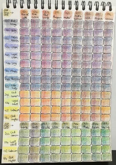
Coloured Pencil Primary Mixing Swatches
I got a new art book for Fathers’ Day. The review is coming very soon, maybe tomorrow. I’m keeping the book a secret for now, but as something it mentioned in passing about coloured pencils that spurred me into action. The author was talking about how mixing layers of blue and yellow made very different greens to individual green pencils. I knew this. It then it recommended that I do some swatches to see which pairs among my primary colours made the most interesting secondaries. Why have I never done this?
So I set about some swatching tonight. I picked out nine reds, nine blues and four yellows (later adding in green gold as a fifth yellow – it was a mistake to leave it out) and swatched all the pairs of colours that didn’t share the same primary category. For each of those pairs, I coloured in a square with one layer of each in one corner, two of each in another and both one/two combinations in the other four corners. And then I smoothed out each square with a paper stump. And what did I find out?
For the purples, it was always going to be the cool red/warm blue combinations that resulted in the brightest mixes – these are generally in the top right corner of the purples in the photo. Helio blue reddish, though, wasn’t as conducive to purple mixing as I expected, with the blue being too dominant over the reds. I found the ultramarine and sky blue to be a bit weakly pigmented, needing a lot of pressure on the pencil point to be able to compete with the reds. And those bottom three blues (pthalo, Prussian and cobalt turquoise) produce some pretty neutral looking colours when layered with pretty well any red.
For the oranges, the warm reds and warm yellows produced the brightest combinations, as expected (bottom left of the oranges in the chart). They look like they’d make good sunset colours or even flesh tones. The cooler reds, like magenta and dark red, tend to produce warm neutral colours when mixed with yellows but cooler reds fare better as long as they’re paired with warm reds.
Finally on to greens. The cool yellow/cool blue combinations in the top right corner produce the most vivid colours but, just as with watercolour, they look a bit too vivid, needing a bit of red or brown in there to bring them back down to Earth. The more interesting greens are where a cool and a warm colour paired together, again something that I’ve seen with watercolour. Delft blue seems to have far too much red within it to be able to produce a green – something worth remembering. And the helio blue reddish, which struggled mixing purples, produces vivid greens, so maybe it’s a cool blue when I’d been thinking all this time it was warm.
But the big lesson here is that these are all interesting secondary mixes. Maybe I should be using more of these mixes in my paintings and steering away from secondaries? In particular, should I try some landscapes at some point with a limited range of primaries (one warm and one cool of each?) and no secondaries? Food for thought. Anyway, it’s gone 11pm now and. I should go indoors and get some kip.
Leave a Reply