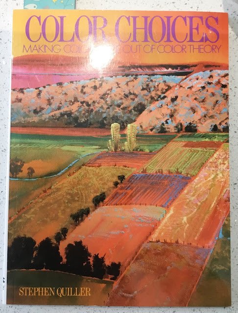
160 pages, paperback. So what's in this book then? Well, the first 100 pages are…

Color Choices, Stephen Quiller – Book Review
You knew it was coming and here it is – the Stephen a Quiller book review. This is a book that’s been on my list for a while and I’ve now finally read it. It’s a 144 page paperback with nice glossy pages.
We start with what everybody always takes about. 15 pages introducing the Quiller colour wheel. There’s a pull out when in the book. I’ve left it stuck in there but other people have managed to pull it out, judging by how many people review this book on Amazon and say that it’s missing from their copy. Anyway, it’s an interesting colour wheel. It has red, yellow and blue equally spaced out, with green, orange and violet equally spaced between them but his colours don’t always match my definitions. What I call red, Stephen calls red/orange, what I call orange, Stephen calls yellow/orange, there are colours that I’d call green that like between Stephen’s yellow and yelllow/green. You get the picture. Anyway, Stephen has put this wheel together after loads of experimentation with colours, making sure that colours that completely cancel each other out are directly opposite each other on the wheel. It’s a wheel to be taken seriously. Because this book was first published in 1989, there are a lot of colours that I use that don’t appear on his wheel but I can always surf around for answers or take educated guesses. It was a relief to see all my earthy colours on the wheel though.
We then get onto the real core of the book where, for 70 pages, Stephen talks about monochromatic, complementary, analogous, split complementary and triadic colour schemes. I was aware of all these types of colour scheme but Stephen goes into lots of details on them and about how, even after choosing the scheme, the artist can still set the mood by choosing which colour should dominate, the range of values and the range of intensities. I found it interesting that in a monochromatic scheme, he was telling us to also use the direct complement of the main colour so that we could have the main colour in a range of intensities from pure to grey. He illustrates this on a colour wheel, with the two colours marked directly opposite each other on the circumference and the range of allowed colours marked along a line from the main colour to the grey at the centre of the circle, so along a radius. With a complementary scheme, however, you can use colours all along the diameter. Makes sense, yes?
After this, the book goes off the boil. We have 30 pages of stuff about how to lay the paint down where I’m never sure what medium he’s talking about. There’s a lot of talk, for example about laying down paint either transparently or opaquely, which confused me as, as far as I’m concerned, watercolours are either opaque or transparent. But there was also some interesting stuff in there about choosing the colour to set the mood rather than to match the subject and making notes (in the form of studies) to remember the mood via colours rather than to remember shapes. And something about coming up with ideas for paintings more from the inside than from the source material.
And then we get to 20 wasted pages talking about artists that it may be worth taking a look at. He talks about 27 artists and their styles (with an emphasis on colour) but only illustrates this with six works. I might have paid this section more attention had it featured artwork from all 27 artists.
I see this book as putting forward a different style of painting rather than being a colour theory reference. It’s about choosing colours to reflect the mood, choosing what sort of colour scheme to use with those colours, how to divide responsibilities among those colours to really reflect the mood, etc. And to do this properly, colours need to be selected properly using the Quiller colour wheel. In fact, halfway through this book, I found myself coming up with the positions of all my box of colours on the Quiller wheel, in the form of angles from 0 to 360 degrees. I then put this all into Excel and got Excel to identify my most exact complements and best triadic and split complementary schemes. And putting stuff on a spreadsheet really hammers home the lessons.
Combining this book with Hazel Soan’s watercolour rainbow, I now have colour database spreadsheet that look like this:
To go the full Quiller, though, would mean two big changes. First, I’d need a lot more colours in my palette. If you’re the sort of person that would rather carry around 48 colours than 12, and choose your colours based on them being closest to clock numbers then this style could be for you. Second, I’d have to throw away a lot of good habits picked up from Hazel Soan’s Watercolour Rainbow. I’d have to start using more opaque colours (because, for example, cadmium yellow is bang on 12 o’clock and cadmium red bang on 9 o’clock and would probably end up going back to the old days of (i) mixing mud and, (ii) having dull looking paintings where the light can’t get through to reflect off the white paper.
So, while a lot of this stuff is genius, it feels slightly flawed genius. And this is a book about a new technique rather than a fundamental theory book. That’s why it falls short of galactico status and only gets (a still amazing) four palettes.
🎨🎨🎨🎨
You can find this book and more reviews of it at Amazon UK here. As an Amazon Associate, I earn commission from qualifying purchases but this costs absolutely nothing extra to you.


Leave a Reply