


It's been a while now since my last painting but I decided earlier in the…
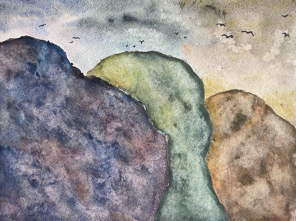
Climate Change In City Of Rocks National Reserve
I need to get back to painting more landscapes, so that I can be ready for Landscape Artist Of The Year if selected as a pod artist or as a wildcard. I’ve decided I’ll be doing three watercolour landscapes in three days. One will have rocks, one greenery and one buildings.
I started today with the easy option. Rocks. It’s loosely based on a rock formation in the City Of Rocks Reserve, a National Reserve and State Park in Idaho. Because there were three rocks in my source photo, I thought I’d have a go at a climate change painting. This is one where I use all three sets of Schmincke supergranulators and transition from tundra colours on one side of the painting to desert colours in the other with Shire colours in between.
I made a mistake straight away with the composition, putting the coolest colours in the nearest rock and the warmest in the furthest away. Everyone knows that cool colours recede while warm colours come forward, so I’d have been better off doing things the other way round. I made a similar mistake with Ross Kemp.
The sky just uses the three sets of supergranulators. From left to right it’s tundra, Shire, desert. For once I existed the urge to use cerulean blue for the Shire and desert skies and just made the best I could have the supergranulators. At the end of the painting I added in the birds to disguise a few rogue drips.
For both the Shire and desert rocks, I started by wetting the whole area and dropping in lights and darks from my supergranulators where er I could see light and dark areas in my source photo. Then I added in slightly thicker paint, creating extra colour wherever I thought it might look good. I also put in some drips of water and granulation medium. As it was drying, I thought the colours looked a bit too dark, so dabbed at them with a kitchen towel, which created some texture as well as lightening the colours.
The rocks came out interestingly variegated in terms of colour and tone but were lacking in three dimensionality, with no cracks or bulges. Some of the edges were softer than I’d have liked too. So I added a second layer of colour in much the same way as the first (so still using granulation medium and kitchen paper) but this didn’t make any difference really.
Oh, and, as usual, the Shire supergranulators were supplemented with burnt sienna for some warmth and with green apatite genuine and forest brown for some dark green hues.
The tundra rock on the left followed the same process except that between the first and second layers of paint I added some sepia and indigo acrylic inks and tried to encourage them to go crazy with granulation medium. I got some interesting effects but the second layer of supergranulators has pretty well covered them all up.
I’m annoyed with myself for the compositional error and where I’m frustrated with myself over not being able to make the rocks look craggy enough. A couple of weeks later and I’ve come to the conclusion that this one has no redeeming features. It’s not going up for sale.
Leave a Reply