


With one eye on my preferred Landscape Of The Year venue, today was a day…

Clifton Suspension Bridge
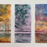
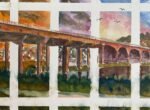
This week’s LAOTY was in Bristol with a view of Clifton Suspension Bridge. It was the episode that I picked out when applying unsuccessfully to be a wildcard. My intention was to paint the bridge in watercolour, dividing my paper into three and painting the bridge under three different skies. Like this. Or this. Or this. But I wasn’t selected, so that’s all by the by.
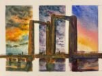
What’s more interesting is that Artist Of The Year put up a Facebook post asking viewers to have a go at painting the bridge. AOTY will look through all paintings in the comments and then share the best ones on Facebook at some point. I had to give it a go, not just for the bantz but to make AOTY aware of my artwork before I apply for LAOTY. There’s a story that’s been going around for a while that some artists get invited onto PAOTY or LAOTY without even applying. That’s why I’m posting this painting in a comment against that post. It gives me a head start in my LAOTY application.
The painting is in soft pastels as this is the medium that I plan on applying with to LAOTY and the medium that I would use on the programme, whether in a pod or as a wildcard. I picked a view of the bridge that would allow the sky to dominate the painting.
As usual, there’s not much to say about the painting process. I worked from the back to the front, using whatever colours felt right at the time. Except that I was more literal than usual for the buildings. They’re already colourful, so I tried to copy the colours I saw. The colours were laid down gently in the sky with the edges of the pastels before being mixed by some rapid finger jamming. The buildings were put in more firmly with the pastels. Everything else was in between in terms of pressure.
After finishing my first attempt, I took a step back to look at the painting and to assess whether it was working. I found lots of minor issues to fiddle with, but there was one major issue worth discussing. The row of grass along the foreground wasn’t working. The grass was all the same length, forming a flat horizontal band along the bottom of the painting. It was also too similar in colour all the way along, in the red and orange tones that you can see in the bottom left. So I went over the grass in the bottom right, making it longer and changing the colour scheme to something more like the greenery on the left bank of the river. And that was me done.
I like this one and I’m hoping any LAOTY judges like it too. There are a couple of happy accidents in there:
- The sky isn’t as crazy and vivid as I was hoping it to be but that’s probably a good thing, not providing unnecessary competition for the bridge, buildings and greenery.
- I made the greenery on the left and right banks different colours to distinguish them from each other. When the foreground band of grass was all red and orange, the painting looked unbalanced. My decision to correct the foreground by greenifying the bottom right rather than the bottom left was motivated by creating balance but had the lucky bonus effect of creating a pathway into the painting from the bottom left corner.
Yeah, this is good. It’s up for sale, with the price to be found here.
Leave a Reply