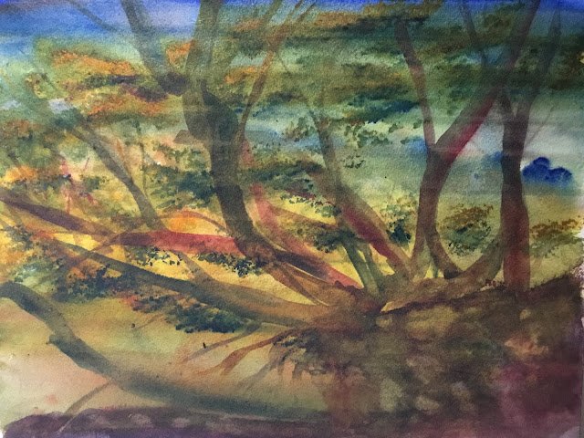
I’ve been meaning for a couple of weeks to head out and do some plein air painting. After a thunderstorm yesterday, the weather felt cooler and cleaner today, so I thought I’d take the plunge. I headed for Queendown Warren, a local nature reserve. The Warren has an open side looking out over a valley and a shady side that’s all forested. After a long walk around the open side and back through the shady side looking for a view to paint, I ended up on the shady side quite close to the car. There’s a huge chalky cliff face in the middle of the woods and I found myself drawn to a tree that was on the edge of the cliff and growing out almost horizontally.
I started by drawing the cliff edge and tree in pencil, including loads of different branches making interesting shapes and winding around each other in places. Then I soaked the paper and put in an underpainting. The painting was French ultramarine at the top (sky), then green as some transparent yellow was mixed in, then yellow (transparent on the right but Indian on the left where I wanted some warmth), back to green again and then more neutral at the bottom with quinacridone magenta added to the mix. I tried to make the upper ground above the cliff a bit more magenta than the green visible in front of the cliff. I spattered in some burnt sienna and raw sienna, then marked in some vague fuzzy background branches with the two browns. Some burnt sienna landed in the sky and actually looked quite good when I turned it into dark streaks. So there were six colours in this one. The key is probably purple cool, as transparent yellow ended up appearing far more than Indian.
When the underpainting had dried, it became clear that I’d made a mistake as my pencil sketch lines were almost invisible. I’d just have to do the best I could with what I had. Maybe next time I need to do the underpainting first then do the pencil sketch on top of it.
So, anyway, I painted in the branches using my main three primaries – French ultramarine, quinacridone magenta and transparent yellow. I variegated the neutral colour, making some branches look more blue/red/green/orange then others. I also put in more random smaller branches. For the foreground, I veered towards red in the neutral colour but also tried to include some green. I tried to flick up some grassy textures in places with a Terry Harrison brush.
Next, I added some foliage to the trees by dabbing on some dry French ultramarine and transparent yellow, again with a Terry Harrison brush, yellow on the upper side of clumps and blue on the lower side. I also dabbed in some a Indian yellow in the top left where I wanted more warmth. And I ran a wet brush through the dabs in an attempt to give them some branches to stick to.
When all this was done, I ended up with something that didn’t hang together. The foliage was too dark compared to the trees behind it. I needed a sauce to bring the meal together. So this was a job for a final glaze. I thought about a yellowy green glaze but instead decided on a gradated glaze: blue at the top, then green, then yellow, then orange. So this is what I did.
With these rescue glazes, they can either turn rubbish into something acceptable or a different sort of rubbish. It seems the perfect risk to me: you can win but you can’t lose. On this occasion I think the painting was still rubbish after the glaze. Maybe it would have helped if I’d applied the glaze carefully – you can see where I’ve not “caught the bead” properly as I’ve worked my way down and ended up with some ugly horizontal stripes. On the other hand, there’s an interesting suggestion of fog at the bottom of the cliff and around the roots of the tree.
In the end, the glaze hasn’t done enough to save this one, so it won’t be going in the shop window. Everything about this painting looks rushed. Maybe it’s because I chose a view that I could only see standing up but spent most of the painting sitting down.


Leave a Reply