29 May 2014 Now this us more like it. It's based on a photo that…

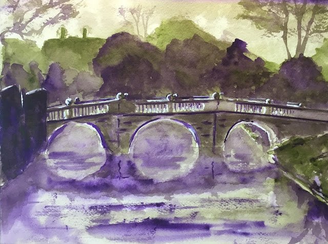
Clare Bridge In Complementary Colours
Anybody else that has read it will know straight away after looking at this that I’m reading Color Choices by Stephen Quiller. There’s a full review coming up soon but I’m already trying out some ideas from the book.
First of all I’m trying this complementary colour scheme. It’s a painting that (apart from the final touches of titanium white) was created using only two colours: Winsor violet and olive green. The thing about these two colours, apart from how I don’t use them very often, is that they’re opposite each other on the Quiller colour wheel. This is supposed to make them great for two colour paintings because they mix to produce great neutrals. A bit of each in the right proportion should make a genuine neutral colour. A bit more of the violet in the mix will make a violety “semineutral”. I would say that a bit more of the olive in the mix would make a greeny semineutral but I think the olive green is almost there already: the violet is a pure colour on the circumference of the colour wheel but the olive green is halfway between the circumference and the centre where the semis live.
Anyway, the idea was to use the two colours in pure form and mixed into neutral and semineutral combinations and to have a variety of different values. The biggest value contrasts and most unmixed colours need to be near the centre of interest and one of the two colours should dominate the other.
That’s a lot to ask. The only pure colours there are the purple under the arches and in the reflections, so that’s not terrible but not great either and a bit planless. When I first stopped to review the painting, I found that what I was trying to make a green-dominated painting was more like 50% green, 50% violet. It wouldn’t have been possible to bring the green back to a majority position (because the violet was so much darker) so I made the painting more violet dominated by glazing more violet over my green background trees. That improved things. But, as well as this, values had been generally forgotten, so I had to do another rescue job at the very end, adding white highlights using titanium white straight from the tube. They made the painting more presentable.
Overall, this was definitely an interesting experiment and I’m looking forward to trying this out with a couple more complementary pairs, although I do need to plan the paintings properly. Really, I should be dividing the paper up into six (say) and doing a set of vignettes with the same complementary pair but using them in different ways, but we’ll see.
I think this one is good enough to go up for sale. To see the price, click here.


Leave a Reply