29 May 2014 Now this us more like it. It's based on a photo that…

Clare Bridge, Cambridge
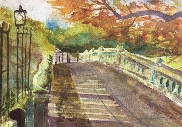
Back to the painting today after what’s been quite a long break. Today’s subject is Clare Bridge from Clare College, Cambridge, a subject that’s been on my to do list for a while. Clare is my second college these days as I’ve got a son there doing engineering.
I did some serious value planning on this one, although most of the value plan was forgotten after I got started. I did manage to reserve a few whites, though, generally on the left side of objects as the sun was coming from the left. As I was expecting the shadows to be the star of the show, I painted this in my favourite shadow key of cool green, using only Prussian blue, transparent yellow and quinacridone magenta. These three colours also make a decent black, which came in handy. No other colours were used in this painting.
The sky went down first, using Brigit Woods’ wet into wet technique. Prussian blue isn’t the best sky colour on its own, so I dropped in some of the magenta in places. While the paper was still wet, I added the background trees using Brigit’s dry into wet technique.
After that, it was a case of just painting on everything else. If there’s anything worth talking about, it’s that I did a bit more glazing than normal. There was a neutral grey/orange glaze over the pebbly bits down each side of the main walkway (after putting down some textured bits first). Then there was a grey/green glaze over the pebbly bits, the walkway and the right hand wall – the left hand wall had been looking much more green than the rest of the bridge and was standing out a bit. And after the tree branch was added, I glazed over some bits in that right hand wall with orange to introduce the branch to the rest of the party.
The shadows and the branch were the least things to be added. The shadows started purple (as complementary to the greens as I was prepared to go) but I added a bit of yellow to them later for a bit of warmth. I messed up not mixing enough paint for the shadows, so there may be some hard edges there in places. I was originally in two minds about whether to include the branch but the painting was looking too green without it, so there was a job to do.
There’s a lot to like about this one: the background foliage greens, the overhead branch and the way it complements the greens, all the colours down the left wall of the bridge, the looseness throughout the painting. The left hand wall of the bridge is where the painting is most focussed, so the nearest ball on that wall is probably the focal point, but that right hand wall still fills a tiny bit too loose to me. That might actually be a good thing, though, and it’s only bad habits that are making me want everything to be in focus. The worst bit may actually be the shadows on the bridge, which don’t seem to have anything casting them. On the other hand, this is also how they look in my source photo.
Anyway, this one feels good enough to be put up for sale. To see the price, click here.


Leave a Reply