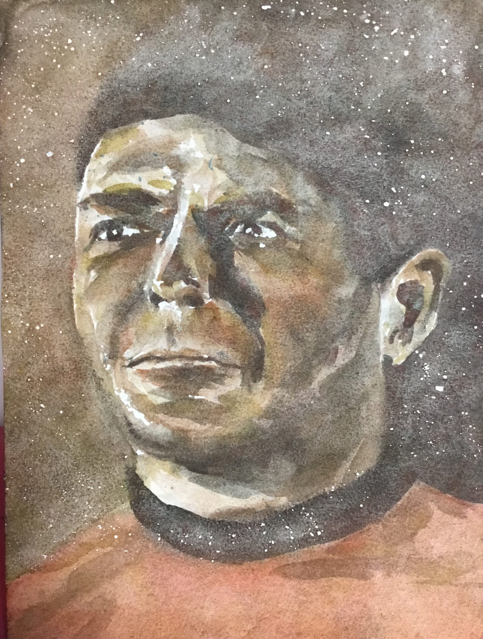
Sometimes great ideas come into my head on my daily walks. Today was one of those days. Earlier this year I put together The Good The Bad and the Ugly Collection. There were three paintings in the collection, painted using the Shire, desert and tundra supergranulators. I enjoyed putting that set together and have been trying to think for a while about how I could repeat exercise with a different collection. Which would mean I needed three subjects with some sort of green/blue/red distinction between them. Maybe they could be portraits too, as I’m enjoying watercolour portraiture so much. And I’m also enjoying using the supergranulators to create starry backgrounds in those planet paintings. So where can I find good facial shots of people that I can categorise as green, blue and red and that might look good with starry backgrounds. I don’t know why it took me so long to come up with this but the Starship Enterprise crew wear greens blue and red shirts and travel among the stars. And only two nights ago I watched The Corbomite Manouver, a brilliant episode that had loads of interesting facial shots showing off highlights and facial planes. So I’m putting together a collection of paintings based on three facial shots from The Corbomite Manouver.
I couldn’t wait to get started and kicked off today with Scotty. He wants a red shirt, so was painted using desert colours. I supplemented these with cadmium red to help suggest the colour of his shirt. Cadmium red is one of the components in desert green, so seemed an appropriate addition to the team.
I started by putting down a pencil outline using a grid. Maybe I was in too much of a hurry but the likeness wasn’t perfect today. I should probably have spent longer on the pencil drawing, using a ruler to accurately pinpoint where within particular squares particular reference points were. In particular there’s too wide a gap between the left extreme of Scotty’s left eye and his ear – maybe I drew the eye too small.
Before putting any paint on, I spattered masking fluid everywhere and tried to remove it from everywhere apart from the hair, the background and the black shirt collar. Not very successfully as I can see there are a few stars showing out on his shirt. I also added a few white highlights, most importantly on the irises in the eyes.
And then I put in the colours. I started with the darks: desert grey and desert green. I tried to make the background behind and above Scotty dark and to not distinguish it from his hair. But I also added the mouth line, nostrils, irises, eyebrows, top edges of eyes and a lot of shadow on the right (our right) of his face. After watering the paint down a bit, I added a few midtones, looking to bring out the eye sockets, some facial creases and some shadows. After the darks were down, I moved on to the mid tones, using the desert brown, desert orange and desert yellow. This was also probably the point at which I added some cadmium red to the shirt. Not enough to make it red red but enough to get it to fit with the rest of the colours while suggesting a shirt that was locally red.
Then I tinkered for a while, trying to tease out a likeness. And, once again, I didn’t manage to do that. Maybe watercolour portraiture isn’t so easy after all and
John Lydon was just beginners’ luck. And, just like the other day with Uranus, the paper started feeling too wet and full of water. Maybe the colder weather is just making paint take longer to dry. I need to add a hairdryer to my Christmas list. Maybe a rechargeable one that I can take out in the field.
Anyway, after deciding that I wasn’t getting any closer to a likeness, I let the painting dry and rubbed off the masking fluid. And that was me done.


Leave a Reply