


This afternoon I took a stroll down to the Tuck Inn, my local purveyor of…
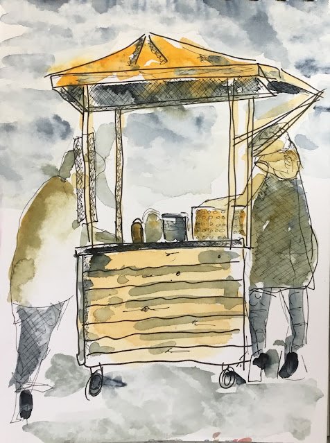
Cherry Stand In Tuck Inn Car Park
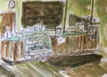
While I was drawing the Tuck Inn, I also had one eye on a stand in the car park where someone was selling cherries. I thought it might make a good dash and splash painting. But it looked as if they might be closing any minute, so my drawing was really rushed. The stand itself is terrible but the unnecessary haste did mean that when I added a couple of people, they were very loose, gestural and energetic.
When I got home, the iPad picked out these three colours for me:

Now that is a grim set of colours. First there’s no red. Red was the colour of the sun umbrella and also the colour of cherries, so part of the atmosphere. A spattering of red at the end would have looked good. But worse still was the greenness of the palette. From yesterday, I know that Winsor orange mixes like a yellow, so I had two yellows and a blue.
Immediately after being presented with these colours, I made a change to my random colour selector. I reclassified Winsor orange from orange to yellow and raw umber from brown to yellow. Yellow ochre was already classified as yellow. This will reduce the chances of me being presented in future with three colour sets that look like two colour sets. Too late for this one though: I’m stuck with two yellows and a blue.
I did the best could with those three colours. This might be the best I’ve been so far at not colouring in. The figure in the left looks good, with lots of white left showing. But those three colours are a bit too drab (and two of them too similar) to make anything interesting.
Leave a Reply