


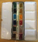
And here it is, the 2021 12-pan palette. The squad has finally been announced.…
Changes to my palette
After reading that Hazel Soan book, I’ve made some changes to my palette.
I’ve now got a better understanding of the difference between transparent and opaque colours. Transparent colours have two big advantages over opaque:
(i) they let the white of the paper shine through, resulting in more vibrant paintings, and
(ii) when used in mixes (in the palette or on the paper, wet into wet) hey are far less likely to turn to mud.
Maybe one of my problems up to now has been that my two yellows (lemon and cadmium) have both been opaque. So, I’m introducing two transparent yellows to my palette. Indian yelow replaces cadmium yellow as my warm (orangey) yellow of choice and transparent yellow replaces lemon yellow as my cool (greeny) yellow. Hazel Soan likes aureolin as a cool yellow but I hear bad stories about how it turns from yellow to grey if a painting gets exposed to the sun. Cadmium yellow will keep a place on the palette but will only be used very carefully. Lemon yellow is expunged.

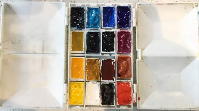
So here’s the rundown of the new, 16-colour palette, left to right, top row to bottom:
1. Prussian blue. Still there. My cool (greeny), transparent blue.
2. Cerulean blue. Still there. Another cool blue but it’s opaque, so to be used with care.
3. Cobalt blue. Still there. Another cool, opaque one to be used with care. My go to colour when I want something in the foreground that screams BLUE!
4. French ultramarine. Still there. My warm (purpley), transparent blue. Will always be a favourite.
5. NEW! Transparent yellow. My new cool (greeny), transparent yellow. Transparent, obviously. Replaces lemon yellow.
6. Payne’s grey. Still there. Will be used mainly for skies from now on. When it comes to shadows, my plan going forward is to use the primary colours already in the painting, either by mixing greys, or by coming up with some complimentary colour to the main colour in the painting.
7. NEW! Sepia. This is a very dark brown that I’ll use for wet into wet shadows as it doesn’t spread out of control. I’ve seen how Hazel Soan uses it for spots on leopards, shadows behind elephants’ ears and outlines around cats’ eyes and it looks great.
8. Quinacridone magenta. Still there. My cool (purpley), transparent red. Will always be a favourite.
9. NEW! Indian yellow. My new (orangey), transparent yellow.
10. Raw sienna. Still there. A cool, yellowy earth colour.
11. NEW! Burnt sienna. A warm, transparent, reddy earth colour. Has lots of uses and its transparency will make it a good substitute for light red at times.
12. Light red. Still there. My main warm (orangey) red. It’s only semi transparent, so I’ll need to be careful with it.
13. Cadmium yellow. My opaque yellow for when I want the painting to scream YELLOW! Its role in mixing oranges and bright greens has been taken by India yellow but it’s still worth its place in the squad.
14. Titanium white. Still there. My opaque white, never to be used in mixes, only really to be used when masking fluid won’t work.
15. Burnt umber. Still there. An earth colour that I use a lot in landscapes.
16. NEW! Cadmium red. My opaque red for when I want the painting to scream RED! To be used very carefully and not in mixes.
The primaries are arranged in a colour wheel order up the left hand side, along the top and down the right. The six utility colours (I think that’s the best collective word for them) fill the other six slots. And in terms of temperature, the coolest colours are top left and the warmest bottom right. I’m looking forward to getting started with this new squad.
Leave a Reply