


Just the one oil pastel piece today. When I was out exploring Queendown Warren the…
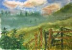
Chalk Face, Queendown Warren
I’ve been waiting a while for today to come round. The weather forecast was for the warmest day of the year so far and I’ve been itching to head outside for some plein air painting and, in particular, some plein air oil pastel painting. My application to Landscape Artist Of The Year this year is probably going to be based on oil pastels, so I wanted both some plein air practice and the chance to upgrade one or more of the paintings that I’m planning to include in my application. So once I was up and dressed, I filled my rucksack with the necessary gear and walked over to the Warren.
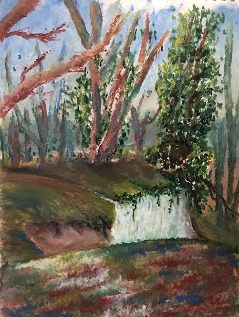
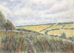
I’d already decided that today’s painting was going to be in the woods rather than on one side of the valley with hinge long views as the latter seemed more suited to watercolour. So I had a wander around the woods and, in particular the area around a huge chalk-walled pit, before settling on this view. It was the chalk face that attracted me to this view: it made an interesting shape and could contrast sharply against any adjacent darks.
I started with a 3×4 grid of squares on the paper. Then I took a couple of photos of the view using the iPad, one in portrait format and one in landscape. I tried cropping both of them to rectangles in 3 vs 4 proportion, playing around to see what I could come up with with the chalk face one third of the way in from each edge. I decided I preferred the portrait format, so saved the photo, then put it through an app that drew a gross of 12 squares over the top. Using the iPad like this helps me to get decent compositions: that’s what’s so great about doing this for landscapes. For portraits, the benefit is, of course, a better likeness.
And then it was on to the pastels. Just like with watercolour, I generally worked from back to front but, just like with coloured pencils, I didn’t stick strictly to this and wandered around the painting. At one point, I had the sky, the background greenery, and some initial bottom layer colour in the pit and over the middleground. Things were looking pretty ugly at this stage and it was a bit unfortunate that this was when I got my one and only passer by of the day. Oh well. Anyway, I should also say that all the colours I had down at this point were mixes of at least three colours – this is the way to go with oil pass.
Anyway, after Sue and her dog had wandered off, I decided I needed to escape from the ugly stage by putting in the trees. The leaves are all sorts of different greens and yellows stippled in, trying to get darker colours on the right and on the bottom of clumps and yellows on the top of clumps and on the left. For the trunks, I had fun throwing in all sorts of colours, including my two favourites, delft blue and deep red. Once. Once the trunk colours were down, I three dimensionalised the trunks using a pointy rubber tool, which wobbled from side to side while moving along the trunks. This is a technique I made up on the spot and worked so well that I’ll definitely be using it again.
At this point the painting was looking in good shape and all I had left to do was to fill in the remaining middleground and foreground shapes. Most of them were quite straightforward. I’d just make loads of marks with whatever colours I could see or that I liked and then smoothed them over with fingers or rubber tools.
Where I had most trouble was with the foreground. I tried all sorts of techniques here, trying to get the impression of a leafy forest floor. I tried stabbing in loads of leaves in autumn colours. That didn’t work. Nor did doing the same thing with wild impressionistic colours. Nor did smoothing out those wild impressionistic colours with a finger (and I tried both stripy and swirly smoothing). Nor did scraping out shapes in the resulting mud with a scalpel or credit card. In the end I reached for my favourite blue and red plus some greens, a yellow and a white and put down some semi random colours. I say semi random because I tried to make a path into the painting with the white pastel and to use dark colours for contrast next to the chalk wall. And then I took a rubber tool and smoothed out the colours in weird right to left wavy zigzags. And this worked! On the left anyway. I needed a couple more attempts to get it to work on the right.
And obviously every time I got frustrated with the foreground I’d step away from it and spot on some more leaves in the trees until I’d cooled down. This is what I mean by not sticking strictly to working from back to front and instead wandering around the painting. Oh, and that brown bit of cliff face to the left of the chalk was also a problem at times, needing a few attempts until I got to something that seemed to fit with the rest of the painting (that pinkish light English red is fast heading up my list of favourites).
And that was me done. I was surprised when I looked at the time. I don’t know what time I started but it was now 2pm. Time had flown. The resulting painting feels like a success and is going in the shop window. I don’t think it’s done well enough to be included in my LAOTY entry though, so maybe I’ll be returning soon to the Warren for another painting using the lessons learned today
This one is up for sale though. To see the price, click here.

Leave a Reply