


No time to do any painting today but with an empty thirty minute window going…
‘Cause I’ve Run Every Red Light On Memory Lane
Today it’s soft pastels. These feel more like a summer medium than a winter medium and, with oil pastels being best suited to the winter, the two types of pastel may end up with a timeshare arrangement in my busy diary. So soft pastels in January might become extinct at some point. But I’m starting to think about this year’s LAOTY entry. I want my main submission to be a soft pastel painting but, looking at potential candidates, And He Ploughed Up The Ground By The Cold Lake Shore was used last year, They Can Always Fly Away From This Rain And This Cold has been sold and Telegraph Road Got So Deep And So Wide is on the wall in the Rose & Crown and might be sold at any point, so it would be smart of me to start on some more soft pastel landscapes. And it’s not escaped my notice that all those three paintings, like this one, are all named after lyrics from Telegraph Road.
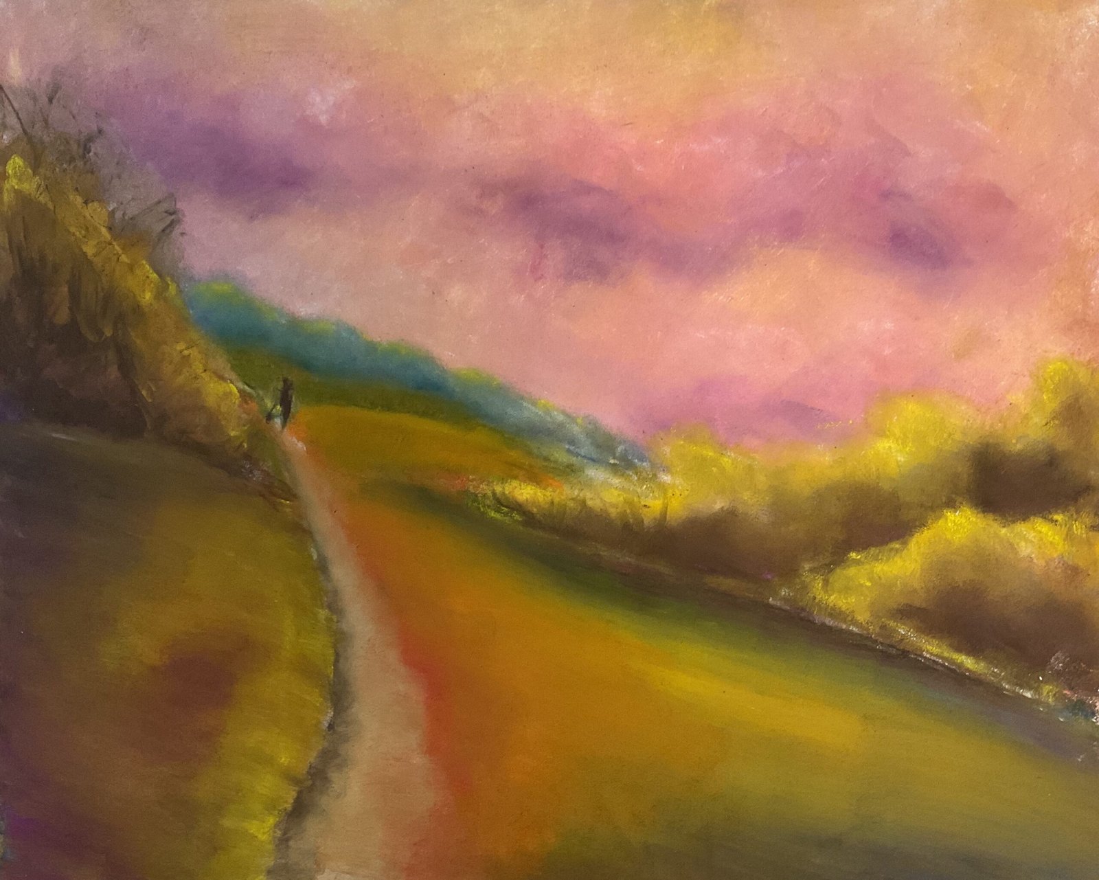
Anyway, on to this one. It’s a scene from Queendown Warren that I’m sure I must have painted before. Its attraction is that it’s made up of a small number of interesting shapes. My objective today was to come up with something that was weighted towards warm saturated colours like reds, oranges, pinks, yellows and purples as this has been enough of a common theme in my soft pastel landscapes for me to describe it as my style in my LAOTY application.
I worked form the back to the front as usual. I started with the sky, putting down lots of warm colours and a bit of white with the sides of my pastels and blending them all together with polystyrene chips. I ended up with what looked like purple clouds, so tried to being these out more with several different purples, the darker ones at the bottom of the clouds. And I used a few flesh tones in places. I think it worked, even if the sky has lost almost all trace of yellows and oranges.
Next were the distant trees and fields. The trees have a blue tone to them, suggesting distance, but might be better in a lighter value or with more blue to them and less green. The field in front of the trees is fine. The middleground to the right of the dog walker is deliberately bright yellow with a hard horizon boundary to draw the viewer’s eye to the centre of interest: the dog walker.
The trees were a mixed bag. I wanted to highlight them on the left in bright yellow and to use darker colours in the shadowy bits underneath. This was pretty straightforward for the trees on the right: no matter how much I fiddled with them they ways came out looking fine. But the left side of the tree on the left is out of shot so I couldn’t be as bold. I did highlight the top of it, albeit not as strongly. I fiddled a lot with that tree and almost created muddy colours but stopped in time. And I’m not that happy with its clean triangular shape.
And then there’s the big grassy foreground area. I didn’t really have a plan for this, so just kept adding layers of colour with the edges of pastels while I was working on everything else. I did decide pretty quickly on the areas that I wanted to be shadowy, all down the left and in a curve under the trees, down the right and along the bottom. I felt these shadowy areas best complemented the other shapes in the painting: they weren’t shadows copied from the source photo. And at one point while adding all these layers, I spotted that I’d created an interesting passage of orange into yellow into green. This gave me the idea for the rainbow effect in the final painting, an effect complemented really well by the curved shadow around it. It took a few attempts before I got to something that felt like it had the right proportions of all the different colours but I got there in the end. I ended up blending the foreground from left to right and right to left after experimenting with up ne down and with leaving scumbly, textural marks.
I added the dog walker at the very end. The view felt empty without him and, with such a large foreground area, a couple of birds in the sky wouldn’t have cut it.
Final result? Yeah, I like this one. The bulging rainbow area is the highlight but there are yellow/purple and red/green complementry clashes and lots of edges pointing towards the dog walker. Somehow my pastel paintings always come out well compositionally. This one’s up for sale, with the price to be found here.
I think I do need to head over to the Rose & Crown at some point, though, and substitute something else for Telegraph Rod Got So Deep And So Wide: that’s the current favourite to be my main LAOTY submission. And I will be buying some workable fixative when it’s next in stock, to mitigate the serious risk of me creating muddy colours.

Leave a Reply