


Before I start talking art, a bit of news. I retired on Tuesday. Eighteen months…
CasD
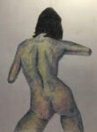
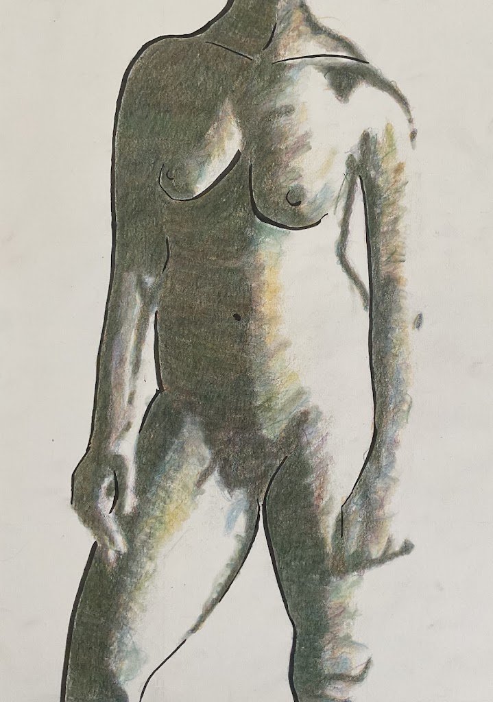
After needing to take two attempts at painting the Earp brothers, I felt like I’d wasted a day of my life, so after finishing the corrected version this morning I was ready to go out to bat again. The idea for this one has been kicking around in my head for a couple of weeks and it felt like a relaxing painting to spend the afternoon on. Today’s model is CasD, making her debut. Make her feel welcome.
The idea was to go for a mixture of a line painting with fineliners and a posterised single valued painting with coloured pencils. I started by putting down a pencil outline and then going over some of the edges with the brush fineliner, a pen that allows me to vary the thickness of lines. I didn’t put in all the edges but was selective. I think I made the right choice of edges, including an indication of the collar bones.
And then it was time to add the coloured pencils. I started with the Notanizer app, looking for a single value plan that would give me the right proportions of dark and light shapes. I found one that I’d liked. In retrospect, maybe I should have deviated from it slightly by leaving out the dark edge down the left of Cas’ torso – it would have made a great lost edge.
I started by shading in all the dark areas with delft blue. Once this was down I didn’t need any source photos on the iPad so could watch the football. Happy St Totteringham’s Day everybody! After the delft blue, I applied another ten layers, all in different colours. I started with dark red, then dark pthalo green, then helio blue reddish, these three making up the foursome of colours that I like to use for dark backgrounds. After this, rather than repeating the same four colours, I started using whatever colour I felt was missing from what was on the paper. And I ended up adding layers of cadmium orange, red violet, green gold, Prussian blue, pine green and dark chrome yellow. Every colour I added seemed to result in a really interesting mix of colours on the paper. But after that tenth layer the tooth of the paper felt full and I had to stop.
I thought there was too much of a contrast between the dark shadow shape and all the white highlights, so with those same colours I added some random scribbles along the edge of the dark shape. Then, to finish off, I applied a blender pen to all the coloured pencil marks. And that was me done.
It’s a good painting, no doubt about that, and up for sale. To see the price, click here. I think the blender pen might have been a mistake though. It’s homogenised the colours too much and I can no longer see the individual pencil colours so well. This might have looked better if I’d just blended the pencils with a paper stump. Or maybe the blended colour might have looked better without the fineliner lines. There you go: I already have two ideas about slightly different approaches next time I try a painting like this.


Leave a Reply