


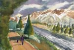
8 July 2018 This one is based on a stock photo that somebody had used…
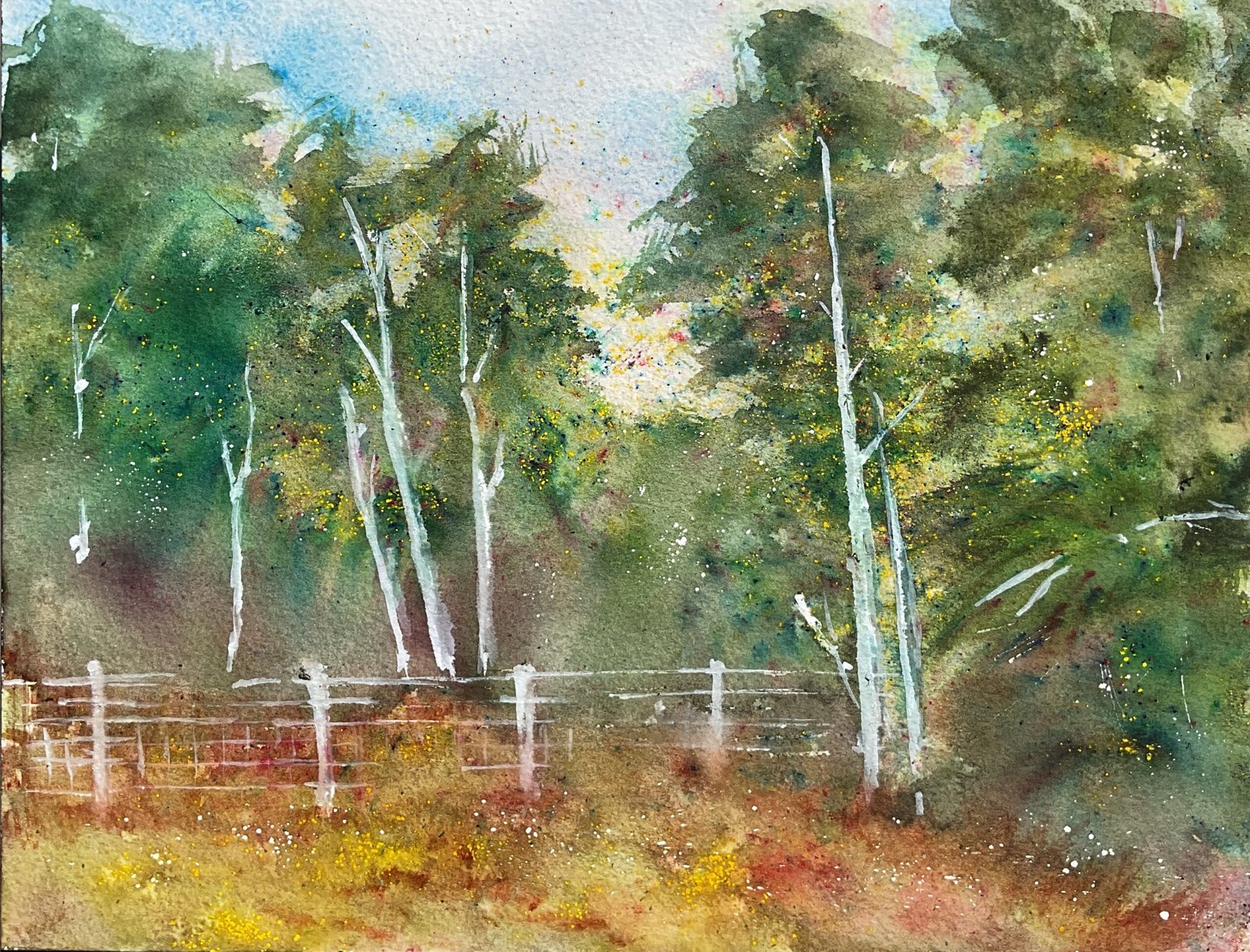
Camp Of The Dog
No book reviews or swatches today. It’s time to start trying out all these new art supplies, starting with the crystalline watercolour. For subject matter I chose quite a plain looking view in Queendown Warren that, with trees in the background and a grassy bank in front, would give the crystals the opportunity to grab the spotlight.
After putting down a sketch with minimal measurements, I masked out the fenceposts, some of the wires and some treetrunks and added some random masked spatters. Then I put down an underpainting with the Shire supergranulators and their four regular coconspirators cerulean blue, burnt sienna, green apatite genuine and forest brown. The idea was that the sky and foreground would still show at the end but that the underpainting of the trees would just be a safety net behind the crystals.
Once the underpainting was dry, I removed all the masking fluid except the random spatters and then sprinkled on the crystals. I tried to use (i) buttercup and poppy in the foreground, (ii) leaf green, olive green and sap green in the lightest areas in the trees, and (iii) dark green and plum violet in the darkest areas. And then I sprayed the crystals with water and selectively ran a brush through them in places, creating some dark tree trunks and some green leafy shapes in the trees. I admit this didn’t go perfectly. There were a couple of times when I sprinkled on far too many crystals and had to sweep most if them up to put back in the jar. And I don’t know whether I’d put on too many crystals but the plum violet areas ended up looking very dark, even with me not running a brush through them, so I dabbed off a lot of this colour.
After that, it was just tinkering. I went over the tree trunks, the fence posts and some of the wires with white gouache. For the treetrunks, the white mixed with some of the colours underneath it to create an interesting silverbirchy grey. I also added more buttercup crystals to the foreground, which needed some colour to balance against the trees. And after removing the masking fluid spatters, I decided that was me done.
It’s a decent enough first outing for the crystals. The buttercup and poppy colours in the foreground look great. For the trees, the colours have been mixed together more than I’d have preferred, with very few of the individual pigments showing but they’ve somehow forced me into coming up with an interestingly variegated set of colours in the trees, something I’d have struggled to do using normal watercolours. The individual pigment I see most of in the trees is yellow but I don’t know if these crystals are stray buttercup crystals or crystals from some of the green mixes.
I couldn’t think of a good name for this one so picked out the name of an Algernon Blackwood short story, one that reminded me of how many dogs I see out on The Warren running off into the grass to have their own private adventures.
And this one was sold within hours of being finished to a member of the local community.


Leave a Reply