


Just six days to go until episode 4 of this series of Landscape Artist Of…
Burning Of The Midnight Lamp
Yesterday’s painting took a while and left me a little drained so I was tempted to take a day off today but I have a physio class tomorrow that means I won’t get time to paint. So I decided to go for a fast one today. This painting uses ideas that I picked up from a Paul Whittaker video on YouTube.
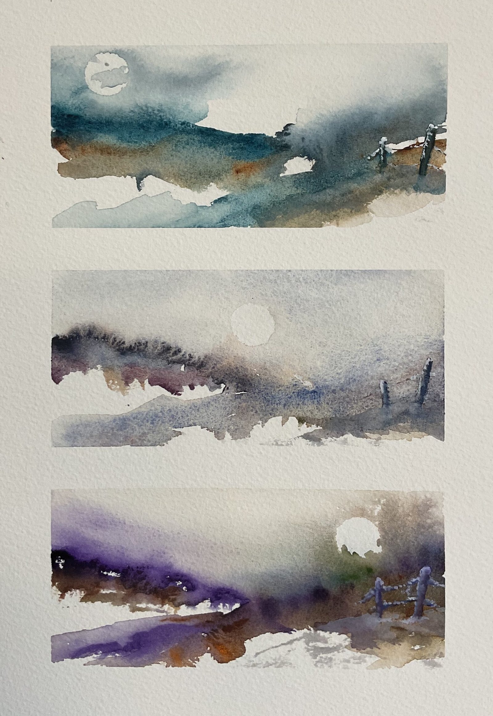
These are three paintings of imaginary landscapes that started with stripes of colour that were then tempted to rise upwards by wetting the paper above them, with the last watery stroke being the bottom one that touches the paint already on the paper. If the paint didn’t move, then I charged in more, dryish paint along the tops of the hills. Once enough paint had risen up to create a sky, I would lift out a moon shape using a 5p coin tightly wrapped in tissue paper.
In his video, Paul used indigo, burnt umber and Payne’s grey. I don’t have indigo in tubes (although I might try it out at some point in place of Payne’s grey) so needed to make up my own colour scheme. I ended up deciding to make this a triptych, with three different colour schemes for three very similar landscapes and with the moon moving across the sky. My three colour schemes, from top to bottom were:
- Mayan blue genuine, burnt umber and Payne’s grey, all from my main palette
- the five Tundra supergranulators with the violet and, to a lesser extent, the blue playing starring roles
- dioxazine purple, cerulean blue, burnt umber and azo orange and sap green from my MGraham honey-based watercolour palette, with the purple being the main star
And I just had fun with all three subpaintings, adding colours wherever I wanted them and letting the painting paint itself. I let some clouds cover part of the moon in the first subpainting and some trees cover it in the third, because that’s what the paint was wanting to do.
I decided to add in the fenceposts to create some focussed foreground shapes and to add to the impression that this was three images of the same scene at three different times of day. I needed to add some white gouache highlights on the posts in the third subpainting to help them show up against the dark shape behind them and, after these morphed into snow, I added a little snow in the same place everywhere else. And that was me done.
And, wow, I’m happy with this! The top two colour schemes in particular work really well and are worth trying out on a larger scale as paintings in their own right. The tundra supergranulators always work, of course, but it feels like Mayan blue genuine, burnt umber and Payne’s grey have all found new purposes in life. The fixed fence posts and moving moon all play their story telling roles superbly, and the straight masking tape edges invoke a feeling of crispness, which fits the theme of the painting perfectly. The only question is why do I spend so long on the rest of my paintings when something like this is so much quicker? This one is up for sale, with the price to be found here.
Leave a Reply