


No time to do any painting today but with an empty thirty minute window going…
Built A Cabin And A Winter Store
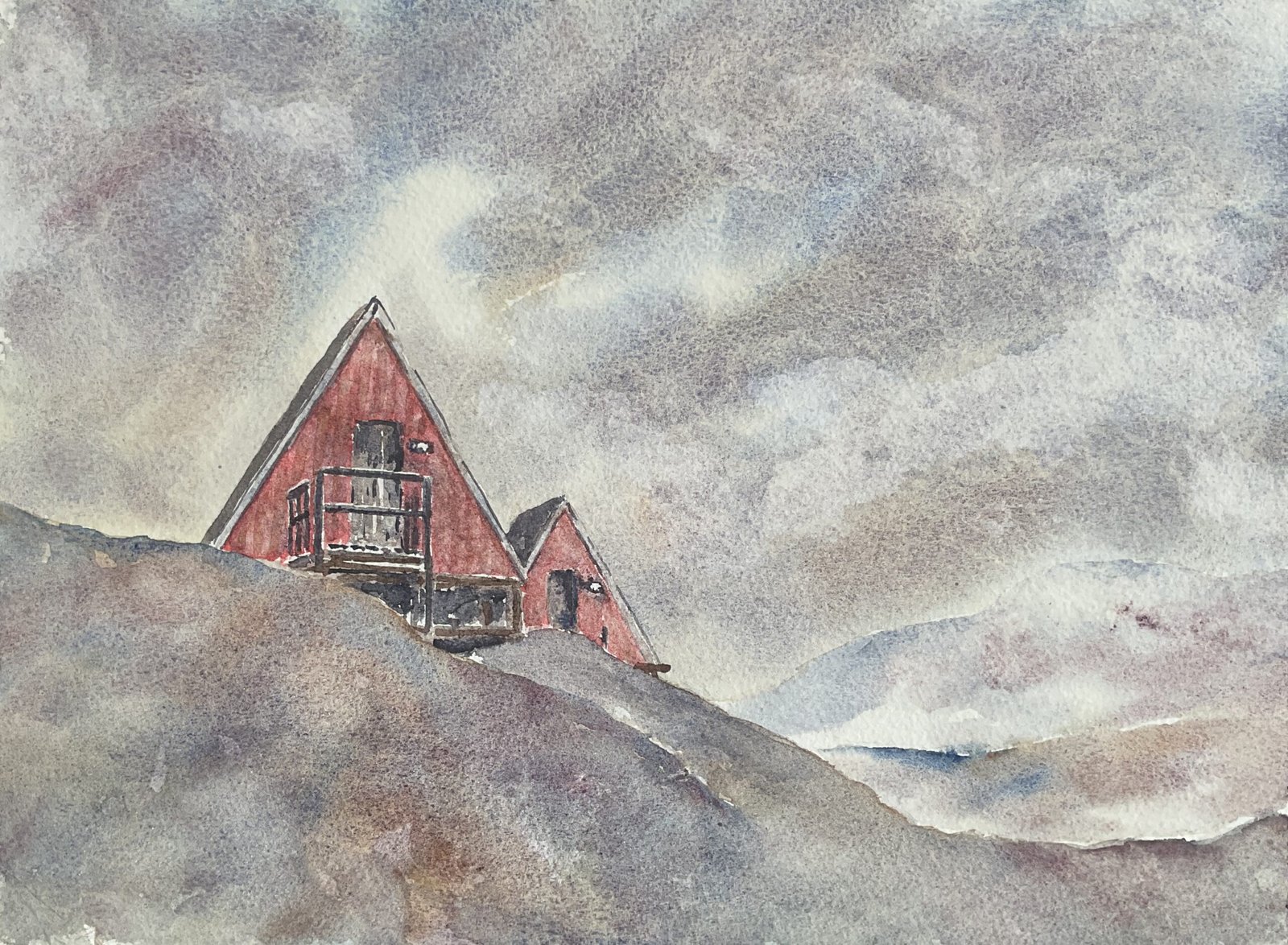
In an attempt to tick off another line from Telegraph Road, I was Googling cabins in Greenland and came across a photo of a couple of cabins (or are they coffee bars?) on Ammassalik Island off the East coast of Greenland and thought they’d be just the ticket. This would be my first Greenland landscape for over a year.
I used the tundra supergranulators for this one (a no brainer) along with rose dore for some much needed saturated colour. This was ll done in a loose, expressive style, a welcome break from being a slave to value plans from the Notanizer app.
After putting down a pencil outline and reserving parts of the buildings, I started with the sky. I used the blue, the orange and the pink, painting lots of bands onto wet paper radiating out from the building and letting them do their own thing. At one point I tried adding dark clouds with the violet but didn’t like this, so dabbed out the darks. I like what I ended up with, with the sun shining through gaps in the clouds in a few places.
Then I moved on to the buildings. Most of this was a glorified colouring in exercise, although I did add second layers in places, notably in the doors but also on the red walls. After completing the rest of the painting, the rose dore was looking too saturated compared to everything else, so I added a thin layer of tundra blue on top, dabbed it off, then a thin layer of tundra orange, then dabbed that off. I put both extra layers on in vertical stripes, looking to suggest wooden planks. What I ended up with was a definite improvement on the original rose dore wash.
And finally I had fun with the snow. I started conservatively in the distance with the blue and the pink. As I got closer to the foreground, I introduced the orange and then the green. I tried adding rocks with the tundra violet but these never looked right, so I quickly dabbed them off every time.
When I stopped and took a step back, I could see two problems with the painting. I’ve already talked about the oversaturated rose dore walls and how I corrected them but there was another issue. The buildings were looking too strongly coloured compared to the snowy bank in front of them. That’s the best way I can describe it. So I darkened all my snow colours on the nearest bank, leaving things looking much better. And that was me done.
I’m happy with the final result. The cabins are now treading that fine line between blending with their surroundings and sticking out like a man made sore thumb. And the sky and foreground colours are off the charts. Tundra colours are ways amazing but leaving the violet out of these passages has taken them to another level. The violet was used in the cabins, though, so wasn’t just benched. This one’s up for sale, with the price to be found here.

Leave a Reply