OK, so I was in an Allman Betts Band mood today. After painting Devon Allman,…

Bubble Horse Horse Bubble
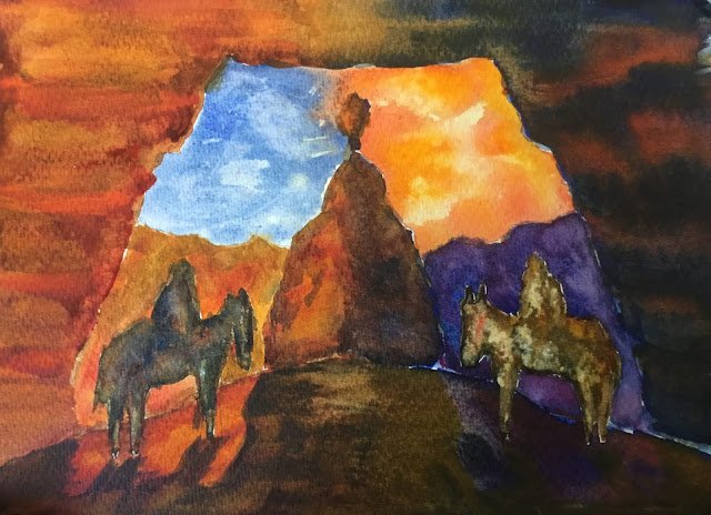
It’s a bank holiday, the sun’s out and I’m back on the watercolours for the first time in months. I’ve been pining for orange over the last couple of weeks but was feeling torn about what to paint. I’d seen some great ideas in Hazel Soan’s watercolour rainbow about how to paint sandstone pillars. But I was also in the mood to paint a purple sky. How could I do both? The answer was a diptych.
I found a great reference photo that a friend (let’s call her Bubble) had posted on Facebook and my original plan was to paint two versions of it side by side. One with blue sky and orange rocks, the other with orange sky and blue rocks. Because it was important that the two underlying drawings be near identical, I started by drawing a couple of shapes on cardboard and cutting them out to draw around. It was only after doing this that my plans changed. I was originally going to do two paintings divided by a white band (using masking tape) but then I name up with the idea of turning the shapes over to get a symmetrical painting. And if I was going to do that, why bother with the white band down the middle? Just let the two run together!
The main three primaries today were rose dore, Indian yellow and French ultramarine. It’s in the key of orange warm, which makes perfect sense given the subject matter. The sandstone on the left started with a burnt sienna wash, then has some rose dore and Indian yellow charged in and finally had stripes of cadmium red drawn in wet into wet. The cadmium red was the big Hazel Soan idea: the stripes blur a bit but (because cadmium red is opaque) it doesn’t go crazy and you can still see the stripes. This is why I have opaque colours in my palette!
On the right, I started with French ultramarine, charged in some quinacridone magenta (as I thought purple would work better than blue and as rose dore is probably too warm to make purples). And then I dropped in the cadmium red stripes again. There’s also some quinacridone magenta in the background hills on that side.
The horseback riders, who were originally masked out, were painted in neutral colours derived from my three primaries, with primaries charged in in places. I tried to make them more blue on the left and more orange on the right.
Then there were the shadows. These were mixed from the three primaries but in slightly different variations with more blue on the left and more orange on the right. Note how even the direction the shadows point is symmetrical. I also added the shadow colours as glazes over the sandstone arch – without this they were looking just a bit too vivid, even for me. And in the rock in the middle, I added some variety with a blue edge down the left and a yellow edge down the right.
Overall, I’m really pleased with the whole concept and with the sandstone pillars (which I really need to try again). The two horse riders don’t look great but I think everything would look a whole lot better if I’d used more water in the background hills and much more water in the sky. It’s values that are the problem today.


Leave a Reply