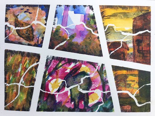
29 June 2018 And now a genuine abstract. What can I say about this one?…

Broken
It’s been brewing for a while but I finally went to the shops yesterday to buy a transparent warm (orangey) red as a potential replacement for the semi-opaque light red currently sitting in my palette. There was no quinacridone red on the shelves, so I went for the other possibility on my list: rose dore. But what to test it out on though? I didn’t fancy painting red/orange flowers or a red/orange landscape, so I thought I’d go for an abstract.
I started by dividing the page into six non-regular quadrilaterals with masking tape. Then I painted some wavy lines over the paper with masking fluid as a way to link the six pictures together. On a separate piece of paper I planned which primary trials to use in each subpainting. I used all six transparent primaries (transparent yellow, Indian yellow, French ultramarine, Prussian blue, quinacridone magenta and rose dore) in six non-identical combinations with each colour appearing in three places.
And then I painted. Each sub-painting started with one layer, then a dry-on dry second layer. It wasn’t until the third layer was applied that I started thinking properly about what to paint. After laying on a dry-on-dry third layer, I came back to each painting and, in places did some wet-into-wet using all three colours. Clingfilm, aluminium foil and salt were used in variously places to add texture. As a last step, I added some borders around each sub-painting with sepia, again trying to bring everything together. Finally the tape and masking fluid were removed and what you see is what I ended up with.
I’m calling it Broken. It looks like a painting with a message, so I’m giving it a name that sounds as if it really does have a message. Which it doesn’t.
What do I like about this one? The way it’s been irregularly divided up and the way the masking fluid lines divide it up in a contrastingly different way. The first two layers in the middle top sub-painting (before the yellow layer) and the top right painting (before the red). The hieroglyphics that the clingfilm added to the cloud space in the top-right sub-painting. And whatever it is in the foreground of the bottom right sub-painting (which saved it). There’s nothing I hate about this one, for a change. Everything that’s bad about it will probably look OK through at last one person’s eyes.
For rose dore, though, the future doesn’t look great. It’s in the top left, bottom left and bottom right subpaintings. I found it to not be very bold, often getting talked over by the blues and yellows. And when layered with either of the blues, it didn’t make purples – it made mud. Once I’ve used up the 5ml tube I bought (probably in delicate flower paintings), I won’t be buying it again. It was a good day for light red and quinacridone red.
And this one’s been sold to another actuary.


Leave a Reply