


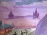
29 May 2014 Now this us more like it. It's based on a photo that…
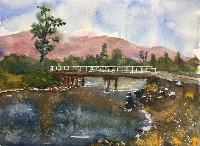
Bridge Over The River Risopatron
So after that brief dalliance with the Artgrafs this morning, I was back to the watercolours in the afternoon. For subject matter, I picked out this abandoned bridge in Chile, one that was taken on a friend’s recent cycling tour of the Andes. So cheers for that, Derek.
For colour, I picked out French ultramarine, Winsor red and transparent yellow, so this was in the keynote triadic left. Cadmium yellow and titanium white made cameo appearances towards the end. I picked out French ultramarine because I wanted some greens (ruling out cerulean blue), none of the Mayan blue granulation and none of the full on–ness of Winsor blue green shade. Having picked a warm blue, I needed a cool yellow to be able to create greens, so transparent yellow was an easy choice. And for the red I picked out Winsor red. Quinacridone magenta would behave given me the purple cool combination that I keep using for white buildings and I wasn’t feeling up to the rewetting travails that come with rose dore. And that’s how I picked out my colours.
Input down a rough pencil outline with the aid of a grid , marked out the rail and posts on the bridge with masking fluid and spattered some more masking fluid in the bottom right foreground area. Then I put down a very tough and ready underpainting. I should have stopped somewhere around here to come up wit/ a value plan but instead moved on to filling out all the colours without much planning.
The mountains came out OK in the background, despite my plan to have them partly obscured by mists coming to nothing. I like how they’ve set up a red/green complementary clash with the trees.
I had several attempts at the water, ending up putting on too many colours and making it too dark, although the resulting mudiness is probably pretty accurate. I threw on some salt and that produced some interesting effects today. I added some ripples and crashing waves in titanium white and also used the white on the other side of the bridge to make the water a lighter value. And I also added some highlights to the bridge’s supporting pillars, lightened some of the bridge’s woodwork and added some fallen logs on the other side of the river.
When the masking fluid came off, the rails and posts on the bridge looked quite bright. I darkened the shadowed sides of everything slightly and then decided to stop there, happy to have some value contrasts on the painting even if they didn’t reflect reality. That’s a good sign, deliberately not replicating what’s in front of me if I can create a better painting by changing things.
Finally, I was wanting to add some foliage I. The bottom right but finding (as usual) that transparent yellow was too transparent and (as usual)reaching for cadmium yellow. I dabbed on the cadmium: yellow with a Merlin brush, then used a small thin brush that was dirty with other colours to move the cadmium) spots upward and turn them into grasses. It looked good. And I added some cadmium yellow to the big bush on the other bank for balance. And that was me done.
I don’t think this one’s good enough to go up for sale. There’s not much to dislike about it but then again not much to love about it either. Or maybe that’s just me.
Leave a Reply