It's been a while now since my last painting but I decided earlier in the…

Bowerman’s Nose, Dartmoor
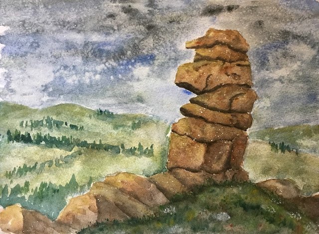
Similar subject matter to yesterday but this time it’s on Dartmoor rather than Bodmin Moor. This is a stack of granite called Bowerman’s Nose.
After sticking mainly to the desert supergranulators yesterday, I thought I’d make a change and use two sets of supergranulators. The idea was to use the desert colours for the Nose and foreground and the Shire colours for the background and sky. But this was just a starting point that I expected to deviate from in places, and that’s definitely something I did do.
Another change to yesterday’s methodology was that I put on a small spattering of masking fluid before starting the painting. Most if this was over the Nose and surrounding rocks but I also included a little in the sky. I find that the little white spots that the mask leaves behind add a little feeling of magic to the atmosphere.
I started with the sky, wanting to use the Shire blue and Shire grey. But the Shire blue, as I already knew but was in denial of, is too green for skies. So I after starting with those two colours, I added in some French ultramarine (chosen because it’s one of the components of Shire blue). I also dropped in some Shire yellow and desert orange just to keep the sky linked to the rest of the painting. And I threw in some salt for more moodiness.
Next were the rolling hills and fields in the background. I stared with Shire blue for the furthest hill on the right and Shire green and Shire olive for the nearer hills but ended up using all those three colours plus Shire yellow and desert orange/brown wherever I wanted to and wherever they looked good. As long as the paper was still wet and I was adding paint that was drier than what was on the paper, I could do whatever I wanted. Eventually I stopped and let the paint dry. Once it was dry, I thought it all looked a bit boring, which was why I added slots of very simple trees using all five Shire colours.
Then it was onto the Nose and rocks and I followed the same process as yesterday. I started with an underpainting over all of it in desert colours, loose and wet into to wet and vaguely trying to use the yellow on the left and the green and grey in the cracks and shadows. After the first layer was dry, I added a second layer much more carefully, one rock at a time and alternating rocks so that they didn’t bleed into each other. In this second layer, I tried to bring out the granulation by charging in extra spots of colour, dabbing in the odd spot of water and occasionally lifting paint off with kitchen paper.
Finally I was left with having to do something about the grassy mound in the foreground. I already had a low value underpainting there from lots of random marks that I’d made with all of the Shire and desert colours while working on the rest of the painting. I thought about adding some sort of layer on top but couldn’t decide between using desert colours (and making it too similar to the rocks and Nose) or Shire colours (which would be too similar to the background, alienating the Nose and rocks). Instead, I hit upon the idea of using the Merlin brush and some dry paint to flick up lots of grassy marks. While Shire blue was my favourite grassy colour because it was dark and shadowy, I ended up using all of the Shire and desert colours. And it ended up helping the while painting fit together.
For a finishing touch, I squeezed out some cadmium red, cadmium yellow and titanium white, intending to add some opaque spatters as a garnish. But I hesitated for a minute and tried flicking up some yellow grass marks on some scrap paper. I decided I quite liked these, so added them to the painting. And then I added red and white grass marks and abandoned the idea of spattering on the opaques.
And after rubbing off the masking fluid and the odd undissolved salt crystal and adding some more paint to one rock that was looking slightly off colour, that was me done.
I rate this one as another success. It looks like it belongs on the front of a paperback. Watership Down or Duncton wood, that sort of thing. I’m starting to feel better about these Shire colours. The trick is definitely to find the right reds to tone down those greens and the desert colours can definitely do that. If there’s one thing about this one that I’m less than 100% happy with, it’s how the two sides of the hill behind the Nose don’t talk to each other as much as I’d like them to: when putting down the initial drawing I made a mistake in drawing them in separately rather than as one energetic gestural line straight through the Nose. Anyway, this one’s up for sale.


Leave a Reply