


Time for a new experience. To get some practice in (just in case I make…
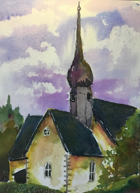
Bodin Church, Norway
My friend Cathy, who takes more photos that would make good paintings than anyone I know is currently enjoying a holiday in the frozen North and posting photos every day onto Facebook. A couple of days ago, she put up a photo of this church in Bolø and I couldn’t keep my hands off it. It’s a white church, so was crying out to be painted in French ultramarine, quinacridone magenta and transparent yellow (the key of purple cool). Titanium white also made an appearance for some highlights at the end. You know it’s been a good day for colours when your brush-drying white sock stuffed with toilet paper comes out looking like this:

After getting down a pencil outline, I started by putting on some masking fluid. Today I negatively painted the sky so that sky colours couldn’t leak onto the church. I also masked out some of the bars in the windows and some holes in the tree on the right for the sun to show through.
Next was the sky (just blue and red) and then the trees on the left (blue and yellow but with some red to tone down the trees. And then came the exciting bit. After removing some of the masking fluid, I put down an underpainting on all the dark shapes, being careful to put in the colours that I could see in the source photo. I also started with some of the impressionistic colours on the white walls. Here’s what the painting looked like thus far. I have to say that underpainting in the darks was looking really professional, like a Peter Cronin underpainting:

The most difficult bit of this painting was glazing a neutral colour over the dark areas. I had to get the consistency exactly right: too watery and the underpainting would be too prominent, too thick and the underpainting would be hidden. I think I got the neutral one the spire right but that on the roofs is slightly thicker than I’d have liked.
The rest of the painting was worked from back to front: the church, then the trees on the right, then the foreground. The gaps in the tree worked out really well and it was a smart move in my part to have a gap in the middle of the foreground greenery rather than copying the source photo and having it go all the way along the bottom.
And then there was the tinkering: a second, smaller shape in the trees on the left, some white highlights, a bit of salt that was supposed to make the roofs interesting but instead gave some texture at the bottom, some more impressionistic colours on the white (enough pure transparent yellow to make it shine), some shadows and contour lines, some hard to see scratches for tiles.
And I quite like what I ended up with. The sky and the trees are magnificent. I like how there’s extra detail in the trees on the right to bring them forward a bit. The white walls and the spire have interesting colours in them. But those dark roofs, despite including some interesting colours are a bit too dark. But, yes, this one’s going up for sale. It’s so hard to go wrong with these colours.

Leave a Reply