


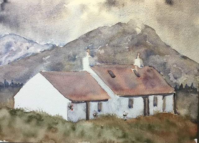
So, as promised, here's another painting of Black Rock Cottage, but this time using more…
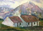
Black Rock Cottage, Glencoe In Tundra Colours
I promised people on LinkedIn that I’d start posting my artwork up there. Yesterday I put up my first figure drawing since retirement and it was taken down within ten minutes for breaking LinkedIn’s community guidelines. Fair enough. I assume this means that anyone posting up Botticelli’s Birth Of Venus will get the same treatment. Either naked figure paintings break the rules or they don’t. Anyway, I felt the need to go back to landscape painting today so that I could post on LinkedIn so I’ve been shivering away out in the garden painting this.
It’s a cottage somewhere near Glencoe up in Scotland. The big attraction in this one was that bright white wall facing to the left and reflecting bright sunlight. I made two changes to the scene, removing some telegraph poles and shortening the mountain at the back so that it could fit on the paper.
It was a tough call over what colours to use for this one. In the blue corner were the tundra colours, capable of making everything look cold and keeping colour saturation low. In the red corner was the key of purple cool, now established as my go to colours for buildings with white walls. I decided to go for the tundra colours (plus rose dore) just for the low saturation levels but may well repeat this painting tomorrow in the key of purple cool, hence the long name for this one.
With all the shapes in this one being quite simple, I put down an initial pencil drawing without using a grid. I also didn’t use masking fluid to reserve the (really important) whites. I trusted my brushwork instead and I think this worked. Then I put on all the colours, working from top to bottom. I tried to keep things quite watery to allow the supergranulating paints to do their thing. For the hanging baskets, I stabbed in dry rose dore and tundra green rather than following my usual path of using cadmium red and yellow. With that side of the building in shadow, I thought the cadmiums would look too bright to be realistic. Where the horizon line was looking flat and boring, I added some trees in tundra blue.
I stopped when I reached the painting you see here. Did I stop too early though? I was wondering whether the roofs needed an extra glaze to darken them to make them stand out against the background, probably a glaze of rose dore. It all depends whether, like an artist with good discipline over value patterns, you see cottages blending into the landscape as a bad thing or, like Kevin McCloud of Grand Designs, you see them as a good thing. In the end I left the painting as it was. If in doubt, stop painting.
I even didn’t add any birds. There’s no sign of life in those cottages, so I didn’t want any sign of life in the sky.
In the end, I think I’ve come up with a good painting and it’s going up for sale. Maybe the values of the roofs are too low, maybe that background hill on the left is too blue. But, no, overall this is pretty good. To see the price, click here.
Leave a Reply