I got all these nine new art instruction books for my birthday. It may take…

Birthday Stash 2 of 3: 24 Winsor & Newton Professional Halfpans
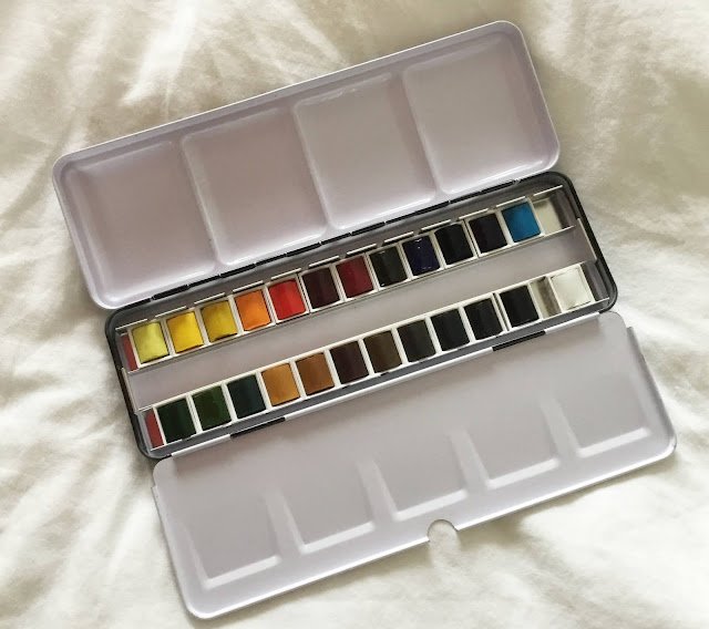
More birthday stash. This was from my kid sister. A tin with 24 watercolour half pans. I’ve talked in a previous post about how I wouldn’t buy a set like this for someone just starting but I’m an experienced artist these days, which is a bit different. So did it hit the mark?
First up, it was a big relief to see that these were professional quality paints and not from Winsor & Newton’s cheaper, student-quality Cotman range.
And they’re pans rather than tubes. While I use tubes, I’m happy I got a set of pans rather than tubes because I can top up pans with tube paint when they’re empty. If it’s a box of tubes, you’re presumably expected to squeeze out bits of paint onto a palette like an oil painter. I don’t like doing that – too much paint ends up getting thrown away.
They’re half pans rather than full pans. That makes things a bit more fiddly with big brushes. Maybe I’ll only do smaller paintings with this set. And when the paints run out I should be able to replace the 24 empty half pans with 12 empty full pans with my favourite colours (From my 16 I’d probably leave out the opaques: cadmium red, cadmium yellow, sepia and whichever of cobalt and cerulean blue is currently occupying the opaque blue slot). On the other hand, the thing about having smaller pans is that there’s room to fit a bigger range of colours in the tin, so let’s look through them. This is make or break time.
– Winsor yellow is a semi-transparent warm yellow. I’d be using this in place of Indian yellow. Being only semi-transparent means it won’t ever displace the Indian but I’m happy to use this for now.
– Aureolin is a transparent cool yellow. The W&N website gives this an A permanence rating but I hear so many bad stories about aureolin turning from yellow to grey in the months and years afterwards that I don’t want to take a chance with it. I’m going to chuck it away and fill the half pan with transparent yellow from the tube.
– Lemon yellow is an opaque cool (greeny) yellow. I did use this colour for ages before replacing it with transparent yellow, another cool yellow but (obviously) a transparent one. But I don’t mind having this colour there. In my normal palette I have cadmium yellow as my opaque yellow for the odd bit of spattering. So lemon will cover for cadmium. Lemon is a cool yellow whereas cadmium is warm but that’s not a problem given how little I use opaque yellows.
– Winsor orange is a semi-opaque, single-pigment orange that’s apparently a “good mixer”. I’ve never used orange paint before, instead always mixing it from red and yellow. It will be interesting to try this colour out.
– Winsor red is a semi-transparent, single-pigment warm red. It looks quite vibrant, like a cadmium red. My normal transparent warm red is rose dore, which is expensive, dual-pigment and a bit lacking in oomph at times. I’m looking forward to trying out the Winsor red.
– Permanent alizarin crimson is a cool transparent red and very similar to the quinacridone magenta that I use. I did use alizarin crimson for a while but switched after hearing so many bad stories about it’s lack of durability. I’ve heard that these problems have been solved (hence the word permanent in the name) but I’m very happy with quinacridone magenta and won’t be switching back. Happy to use the alizarin until it runs out though.
– Permanent rose is another cool, transparent red but is more pinky than purpley. It will be interesting to give this one a go.
– Winsor violet is a transparent violet. Just as with the orange, I’ve never used violet paint, preferring to mix it from primaries. But I’m looking forward to trying this one out.
– French ultramarine is already my warm, transparent blue of choice. Glad to see it in there.
– And Prussian blue is my cool, transparent blue of choice. Another old friend.
– Winsor blue (green shade) is another cool, transparent blue. Other manufacturers make this same colour and call it pthalo blue. I even have a tube of Daler-Rowney pthalo that I occasionally use. It’s a colour that I’d be happy to buy and use if I needed some Prussian blue and there wasn’t any in the shops.
– Cerulean blue is a cool, semi-opaque blue. It’s one that is probably in my top 16 (pushing out cobalt blue) for its amazing granulation ability. Happy to see that one here.
– Viridian is a transparent green that’s already in my 16 colour palette. The only secondary colour I’ve ever used, it’s a turquoisey colour that would be really difficult to mix. And it’s single pigment, so hardly surprising really.
– Olive green and permanent sap green are both transparent, multi-pigment greens. These are probably the two most popular greens out there. I’ve never used them (unless you count alcohol inks) because I prefer to mix greens and these, being multi pigment colours, just look ready-made to me. Buying these would be like buying pre-peeled potatoes. Looking forward to giving these a go but I’ll be dropping in some the primaries rather than using them off the peg,
– Yellow ochre is a semi-opaque earthy yellow. In the days when I didn’t understand the difference between transparent and opaque paints, I saw this as interchangeable with raw sienna. But now I only use raw sienna. I’ll use this yellow ochre though. Just need to be careful with mixing.
– Raw sienna. There you go. A transparent, earthy yellow that’s a must for any palette with 10+ colours.
– Burnt sienna. Another big favourite. A transparent, earthy red/brown that’s a must for any palette with 10+ colours.
– Burnt umber. Oh yes. Keep them coming. A transparent, earthy brown that’s a must for any palette with 10+ colours.
– Raw umber. A transparent, earthy colour that I’ve not used before. Looks yellow/brown. Should be interesting.
– Indigo. An opaque and very dark blue. I’ve used indigo acrylic ink and liked it. I think Jean Lurssen, whose work I really enjoy on YouTube, may use indigo watercolour. Another colour that I’m looking forward to giving a go.
– Payne’s grey. Another old favourite and one of my 16. Glad to see it here.
– Chinese white. This is a semi-opaque white. The white which I use is titanium white, which is opaque and can be used for adding highlights, although it’s not so opaque that it doesn’t need several applications to be able to cover up what’s underneath. I’ve only very rarely used white for anything else (the fog in that Hateful Eight painting springs to mind as the exception). I’m going to leave this Chinese white in there but don’t expect it to see much action if it’s less opaque than the titanium so may end up only being used in foggy mixes. If it’s the last pan left when everything else has gone, I’ll throw it away.
– Ivory black. I’ve never used black and wasn’t planning on starting. It’s far better to mix exciting, energetic blacks from three transparent primaries. On the other hand I hear that ivory black is a granulator, so might add some interesting textures. I’m going to leave this one in there for now and try experimenting with it (maybe on scrap paper first).
So all I’ll be changing in this palette is the aureolin, which I’ll be replacing with transparent yellow. In terms of squad structure, this is a remarkably well balanced squad of 24. If anything I’d replace the black with something else – maybe cadmium red for an opaque red? The quality of the colours (let’s forget aureolin for now) is good with 18 of the 24 being single pigment colours and 16 of 24 being transparent or semi-transparent. They must have been deliberate decisions. It may also have been a deliberate decision to make 13 of the 24 staining colours, making this a good set for trying out some multiple layer glazing.
But do the colours suit me? Once aureolin has been substituted, obviously. Actually, they do. There are warm and cool transparent (or at least semi-transparent) primaries, all my favourite earthy colours, viridian green and Payne’s grey. Any of my most important colours (I’m thinking of my six transparent primaries) that are not in here have capable substitutes. And then the rest of the colours are like a catalogue of all the different colours that I’d like to experiment with at some point but am not brave enough to invest in. Greens, an orange, a purple, a pthalo blue, raw umber, indigo, a granulating Black. It’s like a tasting menu or a variety pack of different malts or gins. But one where the box it came in is something that you’d use for years afterwards.
Conclusion: great present. I’m really happy with this. I wouldn’t recommend a big set like this to a beginner though – check out my separate post on that.


Leave a Reply