


I'm struggling to find much to say about this one. It does pretty well exactly…
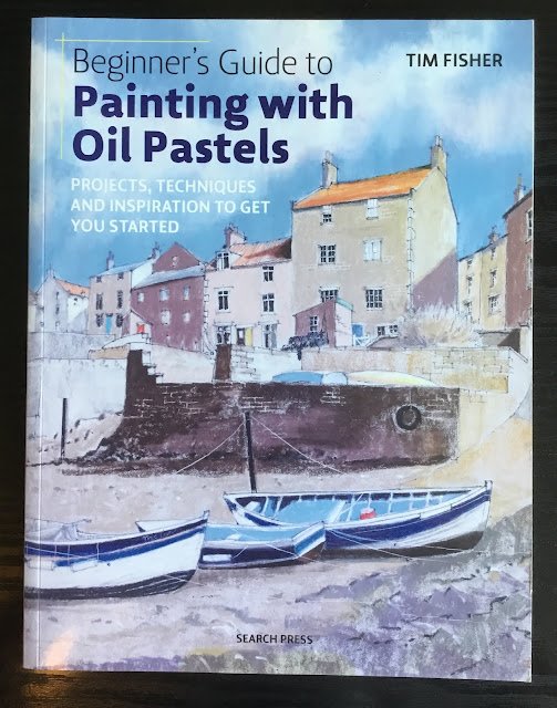
Beginner’s Guide To Painting With Oil Pastels, Tim Fisher – Book Review
Here’s the first of my post-birthday book reviews. This was a (slightly thin) 96 page paperback. The wife bought me it along with the Sennelier pastels and loads of non-arty stuff (that Stevie Ray Vaughan CD was amazing). The people in the shop told her that decent books on pastels are hard to find and that YouTube might represent the best learning opportunity. Still, I think it’s best start with a book, so I’m glad she got me this.
All the value for me with this one was in the first 35 pages. There was some interesting background on materials. Sennelier are the softest and best pastels out there and were developed in response to a direct request from Picasso, which I found amazing. We then talk about tools (and I’ve been straight out to buy a scalpel and some colour shapers) before going on to talk about the types of mark that can be made with pastels and a number of tricks and special effects that can be used. These are all illustrated with some quite short demonstrations. It was a bit odd that the first demo of drawing a red pepper came before the bits on mark making but I could cope with this.
But then we get onto the bad stuff. The rest of the book is taken up with longer demonstrations. There were so many things wrong here but I’m going to have a go at listing them:
– six demonstrations was too many
– the demonstrations were too long, with too many steps (the six of them took up 50 pages)
– the demonstrations were too prescriptive. Not just too much “do this, do that”, which you know I can’t stand, but really prescriptive. Step one isn’t just to draw any old view of a harbour with houses. It has to be exactly the same scene as in the demo because step 16 of 49 tells us to fill in all the houses in the middle row in white except for the fourth along which has to be luminous yellow.
– there are actually bits that are not prescriptive enough. Rather than telling us to “fill in this area in light grey” he needs to tell us how to fill it in. Colour it all in holding the pastel like a pencil? Dab in spots? Gently slide the pastel sideways over the paper? Tim seems to have forgotten this is a beginners’ book.
– too many of the demonstrations were mixed media. I don’t want or need that in a beginners’ book.
– for some of the demos we’re supposed to dig out a plank of wood from somewhere and prime it. Who wants to do that? It’s a beginners’ book, I expect to just be able to do everything on paper.
– in one example, we’re told to cut off slices of pastel, melt them on the hot surface of something that looks like an upturned iron, drip a paintbrush in it and spatter it over the paper. Come on Tim. Why are you talking about stuff like this in a beginners’ book? It belongs in the sort of pastel book that’s the equivalent of an Ann Blockley watercolour book.
– there are no lessons for me in the demos. I have so many questions. Do we do background first then foreground? If I put in the sky first, do I need to leave gaps for hills and buildings or can I paint over the sky? Do I do light colours first then dark, or the other way round? Do I work top to bottom or all over (judging from the demos, I need to constantly be jumping round the painting like I’m spinning plates)? The answers to these questions just aren’t there. It’s like having a really bad school teacher who does stuff on the blackboard and won’t answer any questions.
So, honestly, I’m not impressed. This was supposed to be a book for beginners but it doesn’t answer the questions that I, as a beginner, need answers to. I don’t like those prescriptive demos but, looking through Amazon reviews, there are lots of people that do. I don’t think that even those people would like this book though. It feels ungrateful as this was a birthday present three days ago but I’m only giving this book one palette.
🎨
You can find this book and more reviews of it at Amazon UK here. As an Amazon Associate, I earn commission from qualifying purchases but this costs absolutely nothing extra to you.
Leave a Reply